Thursday, July 30, 2015

Randy Glass [feedly]


----
Randy Glass
// lines and colors

Randy Glass, pen and ink, stipple, portraits, WSJ hedcuts
Randy Glass is a well-known illustrator who specializes in the pen and ink technique of stipple, in which a multitude of carefully placed dots — sometimes of varying size — coalesce visually to create tone.

It's a technique adapted to the relatively low resolution of newspaper printing, in which the artist has more control over the final appearance of the illustration than a mechanically generated screen applied to a continuous tone image.

It also has the effect of being visually appealing in its own right, particularly when the dots are large enough to also provide surface texture. It's especially pleasing to my eye when the dots are arranged in patterns of flow that help define the volume and topology of the face, as in the "hedcut" portraits Glass and a select group of other illustrators draw for the Wall Street Journal (above, middle rows).

Glass also does wonderfully expressive portraits in monochromatic watercolor (above, bottom three).


----

Shared via my feedly reader


Sent from my iPad

Thursday, July 23, 2015

Byam Shaw’s Decameron [feedly]


----
Byam Shaw's Decameron
// Fontcraft: Scriptorium Fonts, Art and Design

Byam Shaw was a great English illustrator of the Victorian period. Stylistically he inherited many of the characteristics of the Pre-Raphaelite and Arts and Crafts artists of the earlier 19th century, putting him in the same category with other late-Victorian artists like Eleanor Fortescue Brickale and William Russell Flint.

Shaw's black and white illustrations are complex and have lots of detail. They are realistic in style, though they often dealing with legendary or mythical themes.

This mini-collection is our second set of Shaw illustrations. They are taken from his illustrated edition of Boccacio's Decameron which features classic renaissance period stories of adventure and romance.

There are 20 illustrations and 4 decorative borders in this collection. You can see samples of all the illustrations below. Just click on an image to see a large preview.

This mini-package is just $12 and can be ordered from our ONLINE STORE

We also have another collection of Byam Shaw illustrations for Legendary Ballads.

illo13 illo12 illo11 illo10 frontispiece illo19 illo18 illo17 illo16 illo15 illo14 border2 border3 border4 border1 illo1 illo2 illo3 illo4 illo5 illo6 illo8 illo9
----

Shared via my feedly reader


Sent from my iPhone

Tweet by Tess Fowler on Twitter

Tess Fowler (@TessFowler)
How to Swipe Like a Pro Redux - colleendoran: It's fairly rare for me to reference photos in my work, or... tmblr.co/ZVKo6x1qEloWt

Download the Twitter app


Sent from my iPhone

Tweet by Boing Boing on Twitter

Boing Boing (@BoingBoing)
Loving these pen/ink works by Krakow-born artist Wojtek Kowalczyk. He trained as an architect. boingboing.net/2015/07/21/woj… pic.twitter.com/b3HCxDuVKP

Download the Twitter app


Sent from my iPhone

illustrationfriday.com


Sent from my iPhone

Saturday, July 18, 2015

Tweet by Kazu Kibuishi on Twitter

Kazu Kibuishi (@boltcity)
Stages of GN production:
1. Design/sketches
2. Thumbnail pgs
3. Pencils
4. Scan/letter/prep for ink
5. Ink
6. Scan, prep for color.
7. Color

Download the Twitter app


Sent from my iPhone

Wednesday, July 15, 2015

Is Berkeley Breathed Returning to Bloom County? [feedly]


----
Is Berkeley Breathed Returning to Bloom County?
// Black Gate

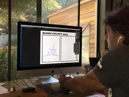
Berkeley Breathed draws Bloom CountyBerkeley Breathed, creator of the Pulitzer Prize-winning comic strip Bloom County, posted the enigmatic image at left on his Facebook page, showing him working on a new Bloom County strip, with the caption, "A return after 25 years. Feels like going home."

Bloom County, one of the finest comic strips of the 20th Century, ran from December 8, 1980 to August 6, 1989. It featured a great deal of political satire and commentary on pop culture, and introduced the characters Bill the Cat, 10-year-old newspaper reporter Milo Bloom, the completely moral-free attorney Steve Dallas, and Opus the Penguin. Breathed ended the strip in 1989 to focus on a Sunday-only comic, Outland, and later a number of best-selling children's books, including A Wish for Wings That Work: An Opus Christmas Story (1991), The Last Basselope (1992), Goodnight Opus (1993), and Mars Needs Moms! (2007), adapted into the Disney flop of the same name produced by Robert Zemeckis in 2011.

Breathed has not elaborated the exact meaning of his comment, but it seems pretty clear he's returning to Bloom County in some fashion (and within hours of his post, speculation had already begun to spread that that's exactly what he's doing, in places like the A.V. Club and Comic Book Resources.)

However, there are some clues in the comments. Donald Trump, who was frequently the butt of Breathed's jokes, and who played a role in the demise of the original strip (the final storyline featuring Trump buying out the strip and firing all the characters, forcing them to find jobs in other comic strips), is now running for President. Asked directly in the comments if Trump's campaign had any influence on his decision to return, Breathed replied "This creator can't precisely deny that the chap you mention had nothing do with it." Stay tuned for additional details.


----

Shared via my feedly reader


Sent from my iPad

Tattoo You [feedly]


----
Tattoo You
// this isn't happiness.


© Thieves Of Tower 2015


© Thieves Of Tower 2015


© Thieves Of Tower 2015


© Thieves Of Tower 2015


© Thieves Of Tower 2015

Tattoo You


----

Shared via my feedly reader


Sent from my iPad

Calamityware: Mugs That Remind You It Could Always Be Much Worse [feedly]


----
Calamityware: Mugs That Remind You It Could Always Be Much Worse
// Colossal

mugs-1

Rendered in a style mimicking traditional blue willow pattern design, artist Don Moyer illustrated these fun It-Could-Be-Worse Mugs that remind you that no matter how bad your day is, things could be catastrophically worse. How bad? Think zombie poodles, pirates, attacking UFOs, and aggressive pterodactyls swooping from the sky. The mugs are a companion piece to his ongoing series of Calamityware dishware with similar abominations depicted on fine porcelain plates first featured here last year. The set of 4 mugs are currently funding on Kickstarter. (via The Awesomer)

mugs-2

mugs-3

mugs-4


----

Shared via my feedly reader


Sent from my iPad
Six Greedy Loafers [feedly]


----
Six Greedy Loafers
// Gurney Journey


Albert Dorne,, one of the founders of the Famous Artist's School correspondence course, shared his thumbnail sketches for a magazine illustration called "Six Greedy Loafers."

The finished picture was used to illustrate a story about an old farmer on his deathbed surrounded by his six lazy sons.


1. In his developmental sketches Dorne first thought of the symbol of vultures sitting around the bed, and wanted to make the sons actually look like vultures with long, scrawny necks and beaky noses. His first sketch tried for that feeling of macabre whimsy.

He says: "As I studied the sketch, it no longer appeared very exciting to me. Despite the outstretched necks, the figures didn't seem to be doing anything in particular."


2. Then he thought of the sons as pallbearers alongside a coffin, but he worried that the arrangement put too much emphasis on the foreground, and spaced them out too equally.


3. He had a breakthrough as he decided to put the sons in a group leaning over the bed. They make a dark, angular mass that contrasts with the light, horizontal shape of the old man. He added the cat to frame the scene from the left. The bottle, the bedspread, and the folds of the bed are all related to the compositional movement.


4. In the next version, he got rid of the black cat and brought two of the figures to the left. Covering up the old man's face adds to the feeling of mystery. But Dorne was now worried about the empty space in the middle and the feeling that the base of the picture was dropping off to the right.


5. In the final arrangement, (which like the others was drawn without reference to models or photography) he tightened up the elements, added the chest of drawers in the background and the rug in the foreground.

Done concludes: "For me, this job teaches an important point. And that point is: Choose an appropriate, effective symbol—here it was the vultures—and stay with it. Regardless of how much you rearrange or discard, never lose sight of the basic feeling or symbol you want to communicate."
-----
Recent book, well illustrated and written: Albert Dorne: Master Illustrator
The sketches above are from the original Famous Artists Course Lessons 1 - 24, which you can still find on Amazon. The link takes you to a set from 1954, by far the best era of the course binders. One day of art school tuition buys the best art education in print you can get.

----

Shared via my feedly reader


Sent from my iPad

Llama Geoglyphs Found in Nazca, Peru - Archaeology Magazine [feedly]


----
Llama Geoglyphs Found in Nazca, Peru - Archaeology Magazine
http://www.archaeology.org/news/3466-150708-peru-nazca-llama
----
Shared via my feedly reader


Sent from my iPad

Wednesday, July 8, 2015

Eye candy for Today: Jan de Beijer ink and wash drawing [feedly]


----
Eye candy for Today: Jan de Beijer ink and wash drawing
// lines and colors

Grebbesluis, Jan de Beijer , pen and wash
Grebbesluis, Jan de Beijer

Ink and wash, roughly 4 1/2 x 12 (120x30cm). In the Rijksmuseum.

With clear observation, economical delineation and a few simple tones, 18th century draftsmana nd painter Jan de Beijer gives us an evocative semi-panoramic scene. It looks to me like the right side of the drawing may have been cut off, perhaps the scene was even wider.


----

Shared via my feedly reader


Sent from my iPad

Tweet by Patrick on Twitter

Patrick (@Vectorpark)
Lee Bontecou, Untitled (2011) pic.twitter.com/xYLXz8tepp

Download the Twitter app


Sent from my iPhone

Friday, July 3, 2015

Eye Candy for Today: Durer’s Knight, Death and the Devil [feedly]


----
Eye Candy for Today: Durer's Knight, Death and the Devil
// lines and colors

Knight, Death and the Devil, Albrecht Durer, engraving
Knight, Death and the Devil, Albrecht Dürer

Engraving, roughly 10×8″ (24x19cm). In the Metropolitan Museum of Art; use download arrow or zoom icon under the image.

Wow.


----

Shared via my feedly reader


Sent from my iPad

Dorian Iten's Accuracy Guide [feedly]


----
Dorian Iten's Accuracy Guide
// Gurney Journey


Swiss artist and teacher Dorian Iten, who has studied in some of the best ateliers in the USA and Europe, is now offering a teaching package that concentrates on how to achieve accuracy in your drawings. 

The teaching rubric of "Accuracy: A Drawing Guide" begins on familiar ground. He takes a line drawing of a figure on the left, and reproduces it on the right. The drawing on the right shows alignments along a vertical line. 

Checking alignments is just one way evaluating a drawing for accuracy. There are four others, and he has concretized these modes of seeing by proposing five kinds of glasses. Each pair of glasses represents a different way of checking. 
Clockwise from upper left, there are the Alignment glasses, Angle glasses, Measurement glasses, "Creaturizing" glasses, and Implied Line glasses. These are all methods used for 2D copying of static subjects; they don't really help you deal with moving subjects, and they're not about constructing forms in space.


Here's what you look for with the Implied line glasses on. The simplified contours seem to extend beyond the small forms and pick up again in other parts of the pose.


To Dorian, these glasses are more than just a metaphor. He actually has his students cut them out of cardboard (but you don't really have to). Here's Dorian wearing the angle glasses. Very stylish.

The entire teaching package includes two videos, a PDF guidebook, and a cheat sheet that thoroughly discuss this clever approach. 

When deciding how to monetize the packet, he decided to offer it as a "$0+" pay-what-you-want product, registered under the Creative Commons license. I asked him why he decided to structure it that way. He said he did it that way because: 
"• I'd like more people to be familiar with it - and use it
• I want to make the guide available to everyone, without a paywall
• PWYW removes the upper ceiling of fixed prices and allows happy/supportive contributors to give as much as they like
• It feels easier to promote than a fixed price product
• If there is a sacrifice of profit in order to reach more people (which there might not be), I'm willing to make it at this point in my journey"
One way to approach the transaction is to download the packet for free, try it out, and then decide what it's worth to you based on how much it has improved your drawing. Then you can go back and contribute based on whether, for you, it was worth the price of a cup of coffee, a magazine, or a day-long seminar.


----

Shared via my feedly reader


Sent from my iPad