Sent from my iPhone
Wednesday, December 30, 2015
Sunday, December 27, 2015
Tweet by Julia Cameron on Twitter
 | Julia Cameron (@J_CameronLive) |
Obsessed with the idea that something must be perfect, we lose sight of the joy of creation. | |
Download the Twitter app
Sent from my iPhone
Sunday, December 20, 2015
Tweet by Freeform Portland on Twitter
Sent from my iPhone
Friday, December 18, 2015
Tweet by Charlie Adlard on Twitter
 | Charlie Adlard (@CharlieAdlard) |
Made with ArtRage for iPad. Another "fun with the Apple pencil" drawing... pic.twitter.com/jERtUK7mKo | |
Download the Twitter app
Sent from my iPhone
Tweet by Richard Johnson on Twitter
 | Richard Johnson (@newsillustrator) |
Drawing up the drawdown: A war artist's work. wapo.st/drawing @PostGraphics pic.twitter.com/u8ktMKQCcR | |
Download the Twitter app
Sent from my iPhone
Tuesday, December 15, 2015
Sunday, December 13, 2015
"Fantasy in the Wild" Coming Wednesday [feedly]
----
"Fantasy in the Wild" Coming Wednesday
// Gurney Journey
The reason I'm at the police station talking to officers in yesterday's post is that I'm painting their police car (below right), and I want to talk to them to understand how they might deal with a situation like this.
 |
| Aftermath, casein, 12 x 16 inches, by James Gurney |
They tell me their first concern is to make sure all the people are accounted for and to see if there are any injuries. They also need to control the scene to prevent further injury or damage and they have to call in fire, ambulance, and utility first responders to deal with the downed power lines, fire hazards, and the traffic.
The painting is part of a new video called "Fantasy in the Wild," which will be released this Wednesday, December 16. We'll take the easel to the streets to paint two imaginative scenes entirely outdoors.
The robot painting takes me to several locations, including a construction site and a fast-food streetscape. I spend some time doing gouache studies of the excavators to understand the mechanics.
The video thoroughly documents two imaginative paintings all the way from the first sketches to the final paintings, using a practical and entertaining "driver's seat" perspective.

You'll learn how to:
• Sketch thumbnails and comprehensives.
• Build a flexible maquette from construction foam.
• Get maximum inspiration from the location.
• Recognize when an idea isn't working and how to fix it.
• Create a viewing grid for an accurate line drawing.
• Imply a backstory with selective details.
• Use casein paint for fast-drying opaque rendering.

John-Paul Balmet, Concept Artist at Lucasfilm describes it as a "fascinating look into a master illustrator's creative and technical process."
The 71-minute video will be available both as an HD download ($14.95) and a DVD ($24.50). On the release date, Wednesday, December 16, they'll both be 10% off. Tomorrow I'll talk about the other painting.
The 71-minute video will be available both as an HD download ($14.95) and a DVD ($24.50). On the release date, Wednesday, December 16, they'll both be 10% off. Tomorrow I'll talk about the other painting.
----
Shared via my feedly reader
Sent from my iPad
Salvador Dalí (Spanish Catalan, 1904-1989)Illustrations for... [feedly]
----
Salvador Dalí (Spanish Catalan, 1904-1989)Illustrations for...
// The Curve in the Line
Salvador Dalí (Spanish Catalan, 1904-1989)
Illustrations for Lewis Carroll's Alice in Wonderland, gouache, 1969
- Advice from a Caterpillar
- Down the Rabbit Hole
- The Pool of Tears
- The Rabbit Sends in a Little Bill
- Mad Tea Party
- Who Stole the Tarts?
- The Mock Turtle's Story
----
Shared via my feedly reader
Sent from my iPad
The First Artists [feedly]
----
The First Artists
// Archaeological Headlines - Archaeology Magazine
Hand stencils believed to have been created more than 30,000 years ago have been found in limestone caves on the Indonesian island of Sulawesi. Dating cave art is notoriously difficult. But a team of researchers has taken advantage of serendipitous conditions in caves on the Indonesian island of Sulawesi to establish that images there rival any known from Western Europe in terms of age. A stencil created as the artist blew pigment around a hand is at least 39,900 years old, they report, and a painting of a piglike animal was laid down at least 35,700 years ago. The researchers established the designs' minimum ages by calculating the dates of deposits that had built up on top of the pigment. They had observed that, as mineral-laden water percolates through the caves' limestone walls, calcite gradually accumulates on their surfaces. These deposits contain uranium, which decays to thorium at a known rate, so their age can be ascertained from the ratio of the two elements. The discovery raises a new question: Did people in Southeast Asia and Western Europe develop artistic expression independently, or was it pioneered by early humans before they left Africa? "We don't know," says Maxime Aubert of Griffith University in Australia, "but my opinion is it probably developed a long time ago, in Africa, and then it just spread out."
----
Shared via my feedly reader
Sent from my iPad
Saturday, December 12, 2015
Tweet by Patrick on Twitter
 | Patrick (@Vectorpark) |
Babbage's sketches for the Difference Engine. I love seeing drawings by inventors. pic.twitter.com/73rkENpYhs | |
Download the Twitter app
Sent from my iPhone
Friday, December 11, 2015
Leonie Bos’ architectural illustrations are informed by traditional printmaking [feedly]
----
Leonie Bos' architectural illustrations are informed by traditional printmaking
// It's Nice That
Amsterdam-based illustrator Leonie Bos' architectural forms are minimal and modernist, and their simplicity is what makes them so appealing. Taking influence from traditional printmaking, Leonie's digital images are created by layering semi-transparent colour areas to create new shades and tones. The off-white grain of the paper is just as important to Leonie, and she often consciously leaves patches and squares ink free. Texture as a whole seems vital to her work, with rough gradients of colour giving the impression the images have been printed on concrete.
----
Shared via my feedly reader
Sent from my iPad
Harold Speed, Chapter 4: The Painter's Training [feedly]
----
Harold Speed, Chapter 4: The Painter's Training
// Gurney Journey

Today we'll take a look at Chapter 4: "The Painter's Training" from Harold Speed's 1924 art instruction book Oil Painting Techniques and Materials.
I'll present Speed's main points in boldface type either verbatim or paraphrased, followed by comments of my own. If you want to add a comment, please use the numbered points to refer to the relevant section of the chapter.
1. The traditional way of teaching painting is to teach Drawing first, then Painting. It's better to divide the problem into three interrelated elements: Form, Tone, and Color.
By Form I think he means both outline and modeling of 3D bulk. By Tone he means light or dark value, both tone as a function of design and tone as a function of defining 3D. Color presumably means both hue and saturation, but Speed points out it can't be seen separately from tone. Speed suggests that in the French academic schools, tone was overemphasized.
I'm still a little confused by this. I don't see how Form and Tone can really be separated.In Speed's scheme, then, when does the student make the switch to painting, and what are they doing exactly at each stage? I haven't reviewed the chapters ahead yet, but I suppose this will become clearer.
| Lilian Braithwaite by Harold Speed |
2. Systematic training isn't much help for design (or composition).
This comment, made in passing, struck me as an important one, and it's why I resist the idea of writing a book with any kind of authoritative tone on composition. Unlike the fields of color and light, which are full of verifiable facts, composition is elusive. Speed says it's unteachable, and not a subject for hard drilling. Still, I think it can be addressed in a classroom setting on an individual and a picture-by-picture basis by a mentor figure, the way Howard Pyle did.
The minute someone says that here are "The Five Laws of Composition" or "The 20 Don'ts of Design," I start thinking of masterworks that are exceptions to those laws. Composition by statute leads to sterile, conventional, and forgettable pictures.
 |
| Morelli, Temptation of St. Anthony |
3. "Before you can express anything you must feel something to express."
Here's another comment made in passing that is essential to the study of picture-making. Speed criticizes work that is solely an excuse for an "unimpassioned rendering of the appearance of things." The works that stick in our minds are the ones that are both deeply felt and masterfully painted, and as a result the feelings transmit to the viewer.
4. "The English language is not very rich in terms that express aesthetic things."
So true, and a good reason why painters have had to learn foreign vocabularies for words like effet, which were so central to foreign training. French and Italian languages have a great many words that have now been adopted in many painting ateliers, but that's another topic for a blog post.
5. "The heightened effect that there is in all artistic work, and which is in a way a departure from cold accuracy, must not be made the excuse for careless and slovenly work."
I've noticed that the words "creative" and "expressive" are often used nowadays as code words for sloppy work, but they shouldn't be.
6. Western art is more concerned with naturalistic outward appearances than Eastern art, but in the great Western works, there are "variations from strict accuracy."
And Speed points out that these subtle expressive enhancements and aesthetic choices in realist painting have escaped critics. That's more true now than ever because most mainstream art critics are so visually unaware. As Speed says, realism makes the work "persuasive to the beholder" but it's only the first objective in doing something with lasting meaning. The expressive quality is more valuable, and he reminds us that a strongly expressive work that is executed with some rough technical edges may be preferable to a technically polished work that is empty of feeling.
7. "Nature is not one of those who disclose their best to a shallow observer; she only reveals herself fully to those who seek her reverently."
This is because it takes a lifetime to learn to see. And it's not just a matter of seeing optically with the eyes. It's about apprehending with compassion and insight. One has to perceive what is fine in a subject and bring that out. Speed reminds us that we need to call up from memory the fine things one has seen in art and nature and bring that out in what one is painting.
8. "If you cannot paint what you see, you will find yourself handicapped in trying to paint what you imagine."
This is why it's so important for fantasy artists and concept artists to paint outdoors. What you can paint from your imagination will only be 75% as convincing as what you can paint from nature.
"Vast themes seem to demand simple language for their expression."
You can insert any Rembrandt painting here.
Speed finishes the chapter with more thoughts about Impressionism and Post-Impressionism, but hopefully we covered that ground in the last few sessions.
 Next week—Chapter 5: Tone Values
-----
In its original edition, the book is called "The Science and Practice of Oil Painting." Unfortunately it's not available in a free edition, but there's an inexpensive print edition that Dover publishes under a different title "Oil Painting Techniques and Materials," and there's also a Kindle edition.
----
Shared via my feedly reader
Sent from my iPad
Franz Sedlacek - Illustrations from Simplicissimus, 1916-26 [feedly]
----
Franz Sedlacek - Illustrations from Simplicissimus, 1916-26
// MONSTER BRAINS
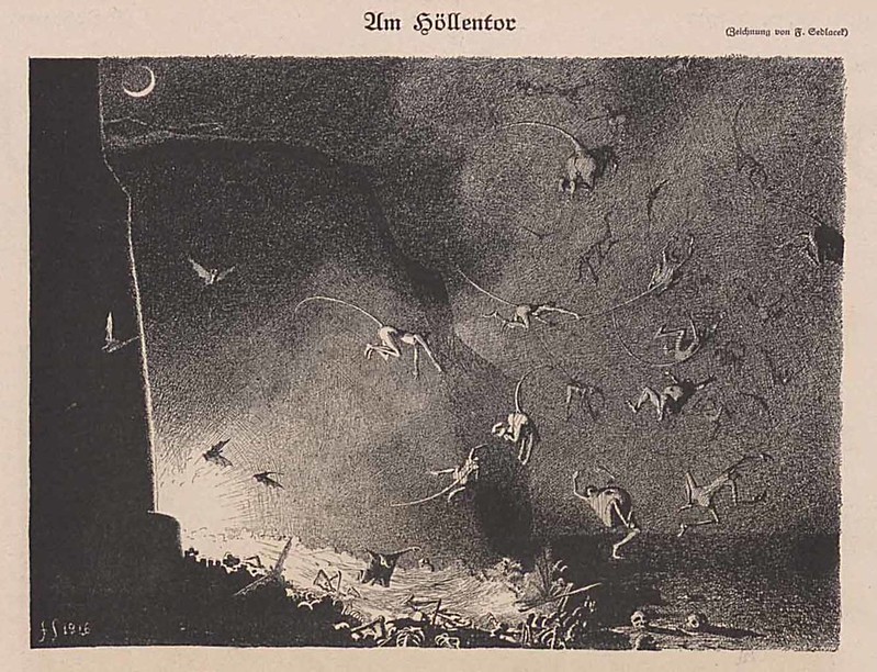 At the Gates of Hell, 1917
 Ghosts, 1926
 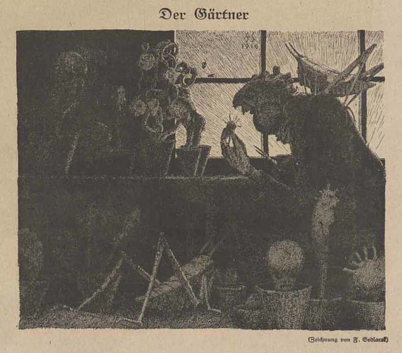 The Gardener, 1918
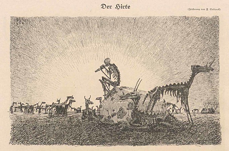 The Shepherd, 1917
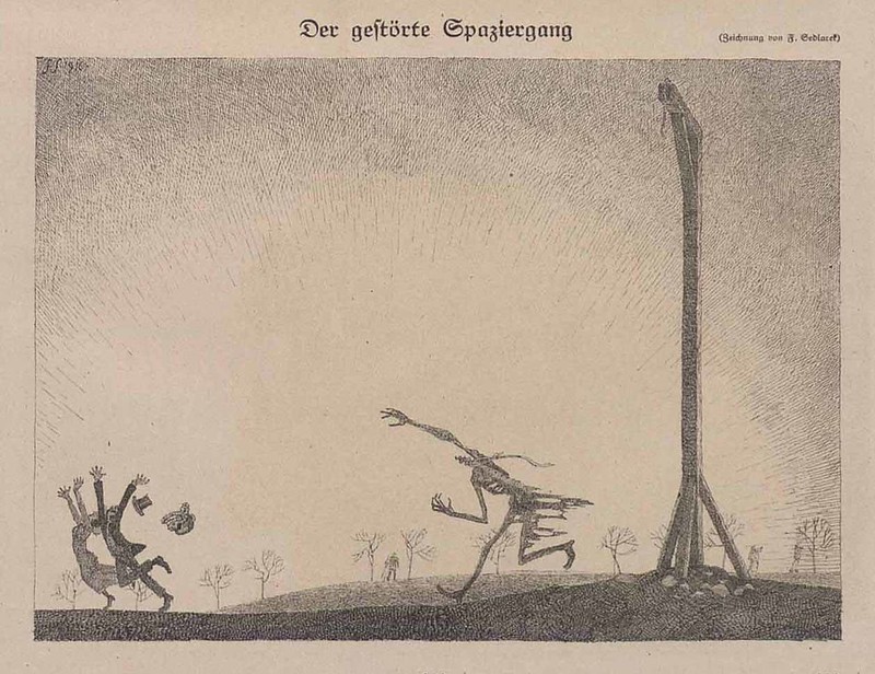 The Disturbed Walk, 1917
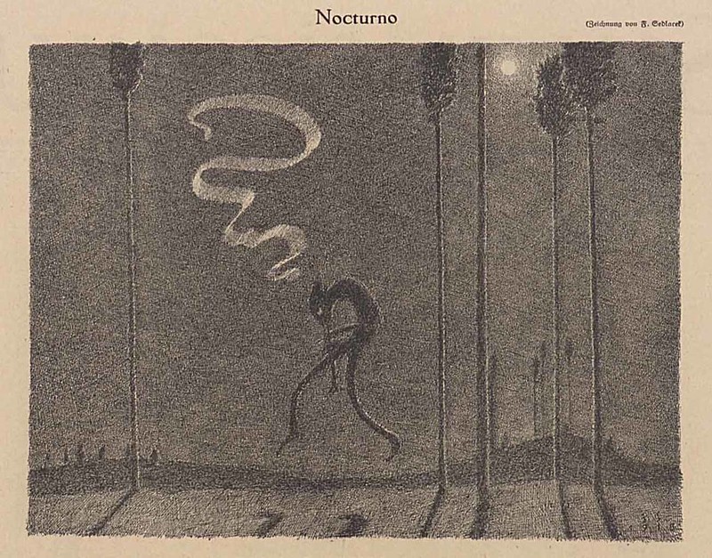 Night, 1919
 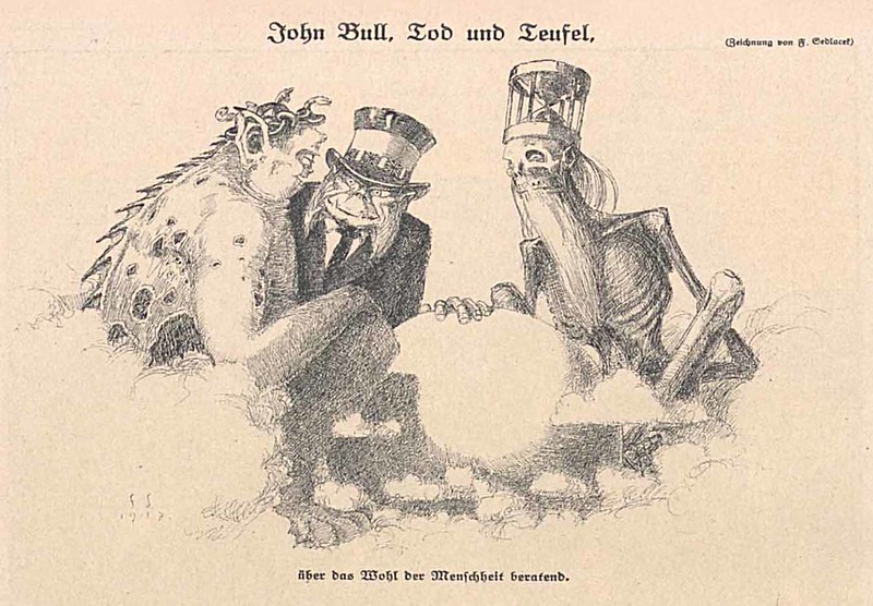 John Bull , Death and the Devil, 1917
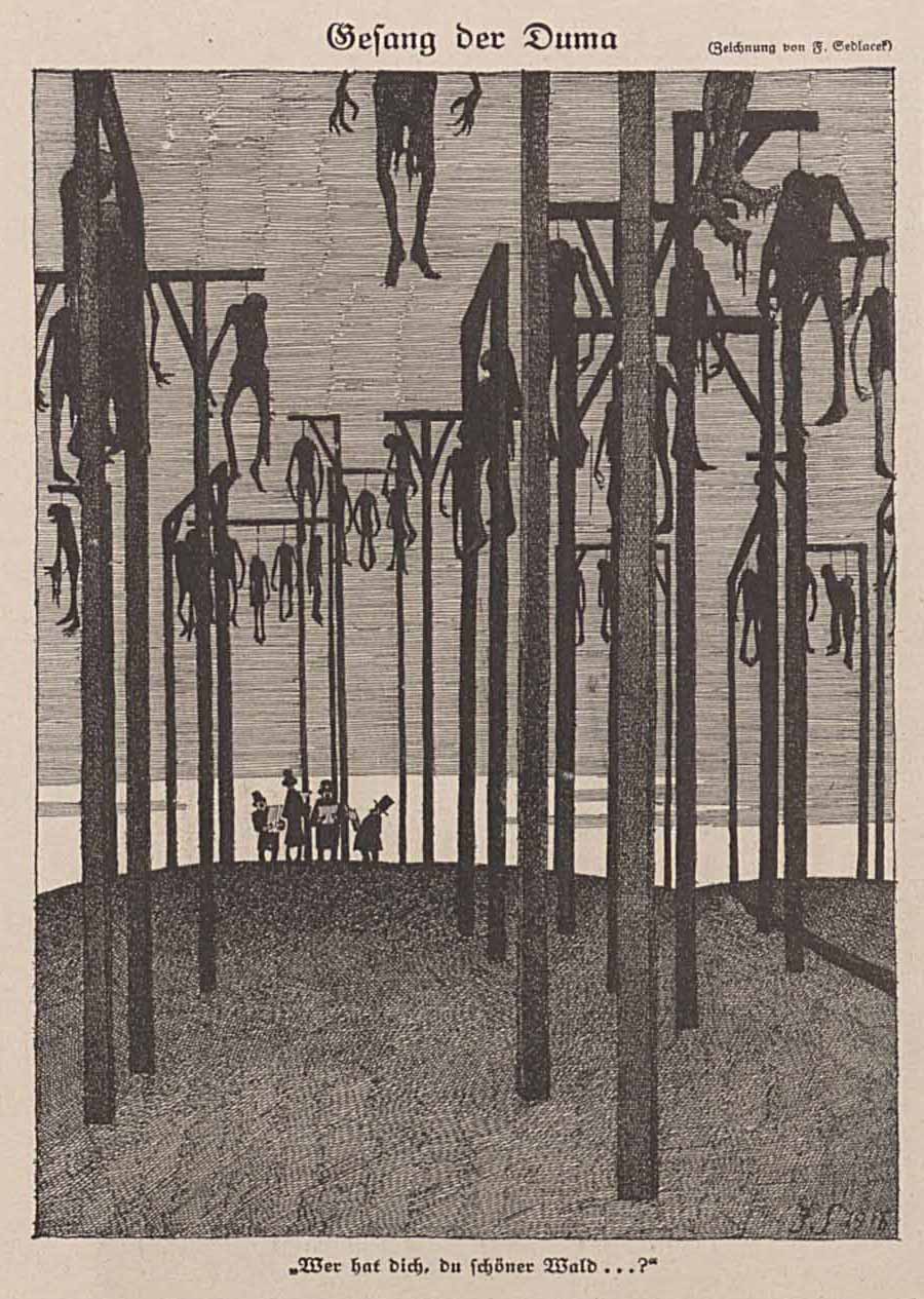 Singing the Duma, 1916
 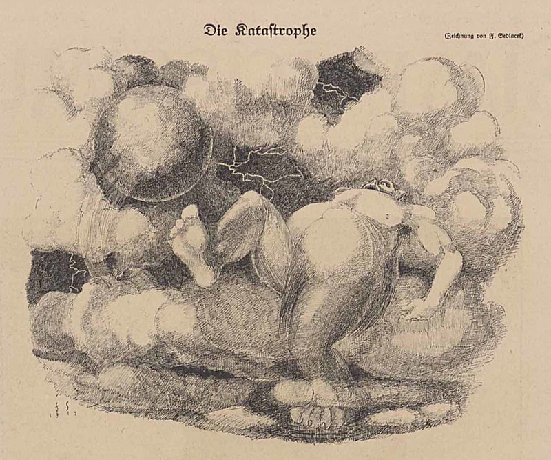 The Catastrophe, 1919
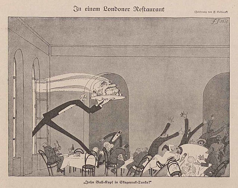 In A London Restaurant, 1916
"Simplicissimus was a satirical German weekly magazine started by Albert Langen in April 1896 and published until 1967, with a hiatus from 1944-1954. It became a biweekly in 1964.[1] It took its name from the protagonist of Grimmelshausen's 1668 novel Der Abenteuerliche Simplicissimus Teutsch." - quote source
There is a huge archive of all previous issues of Simplicissimus here which I've been picking through over the last few weeks. I've been finding a lot of great artists hidden amongst the issues such as Alfred Kubin, Paul Weber, Heinrich Kley, Karl Arnold, Theodor Kittelsen and many others. I'll be sharing many of my findings in the coming days and weeks, beginning with this assortment of rarely seen artworks by Franz Sedlacek.
You can find additional works by Sedlacek in this previous post.
----
Shared via my feedly reader
Sent from my iPad
Thursday, December 10, 2015
Exposición de Juan Giménez. III Salón del Cómic de Navarra 2012d
I believe these are all handpainted originals.
Monomiki's Doodle Dump: More stuff.
One of my favorite artist's sketchbook and tablet (?) stuff.
Monomiki's Doodle Dump: More stuff.: More stuff.
Monomiki's Doodle Dump: More stuff.: More stuff.
Wednesday, December 9, 2015
Tuesday, December 8, 2015
Saturday, December 5, 2015
Tweet by Giuseppe Castellano on Twitter
 | Giuseppe Castellano (@pinocastellano) |
Don't EVER postpone plans because "it isn't the right time" or because you're "not ready". Do it while you can. Inaction is costly. #arttips | |
Download the Twitter app
Sent from my iPhone
Thursday, December 3, 2015
Wednesday, December 2, 2015
Tuesday, December 1, 2015
Subscribe to:
Comments (Atom)


