Monday, December 25, 2017
Saturday, December 23, 2017
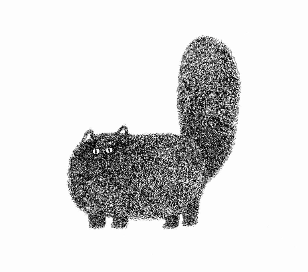
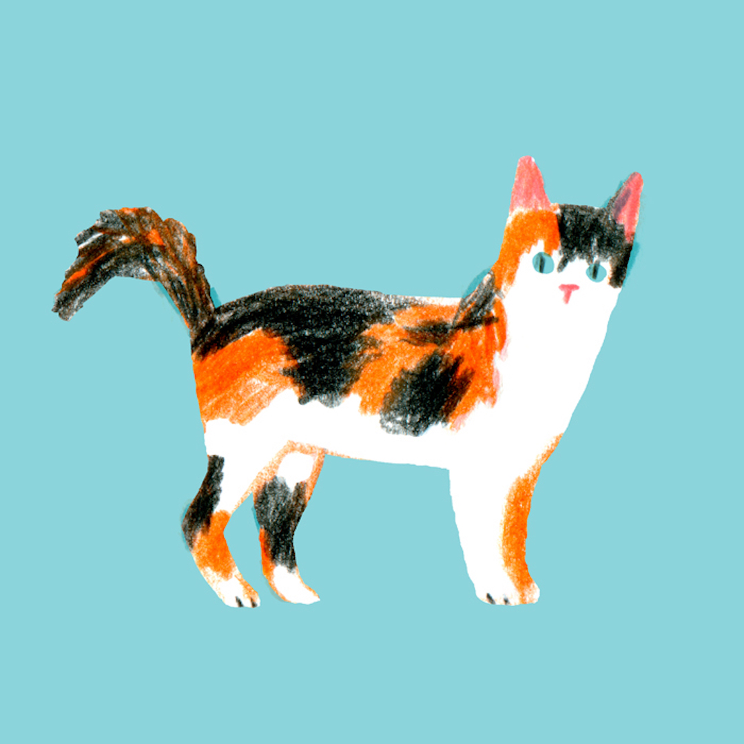
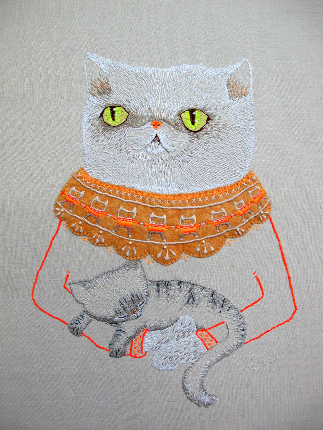
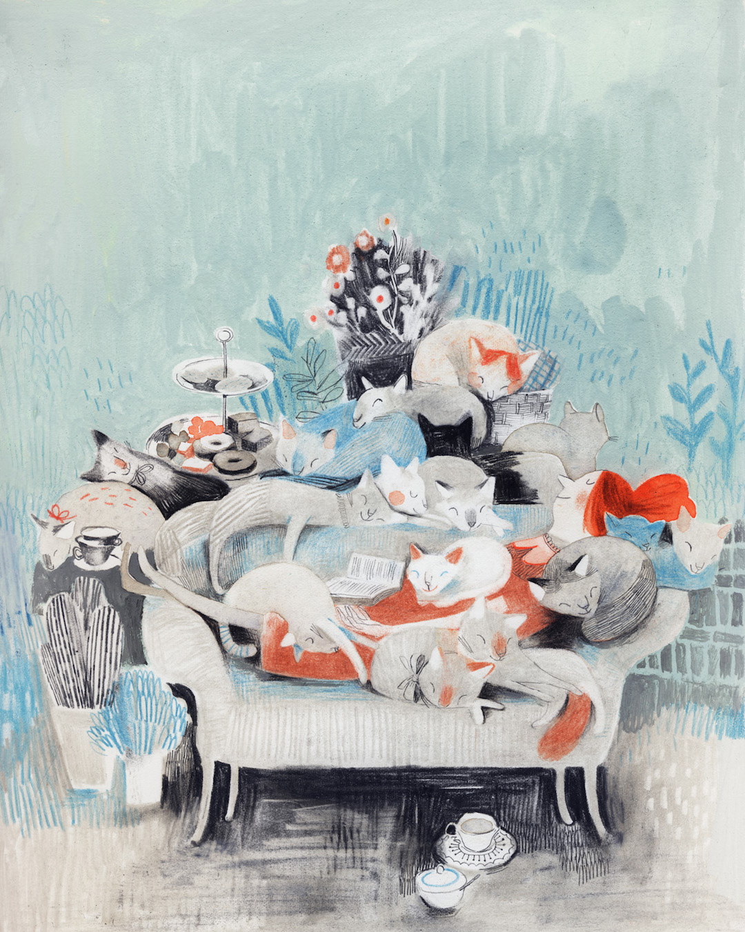
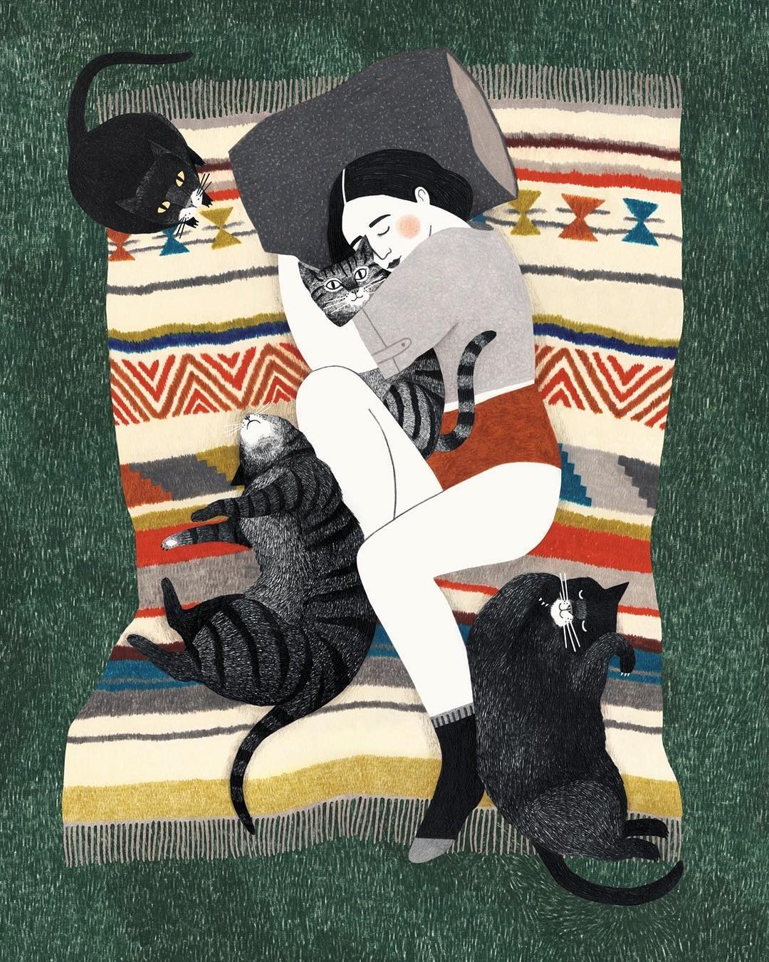
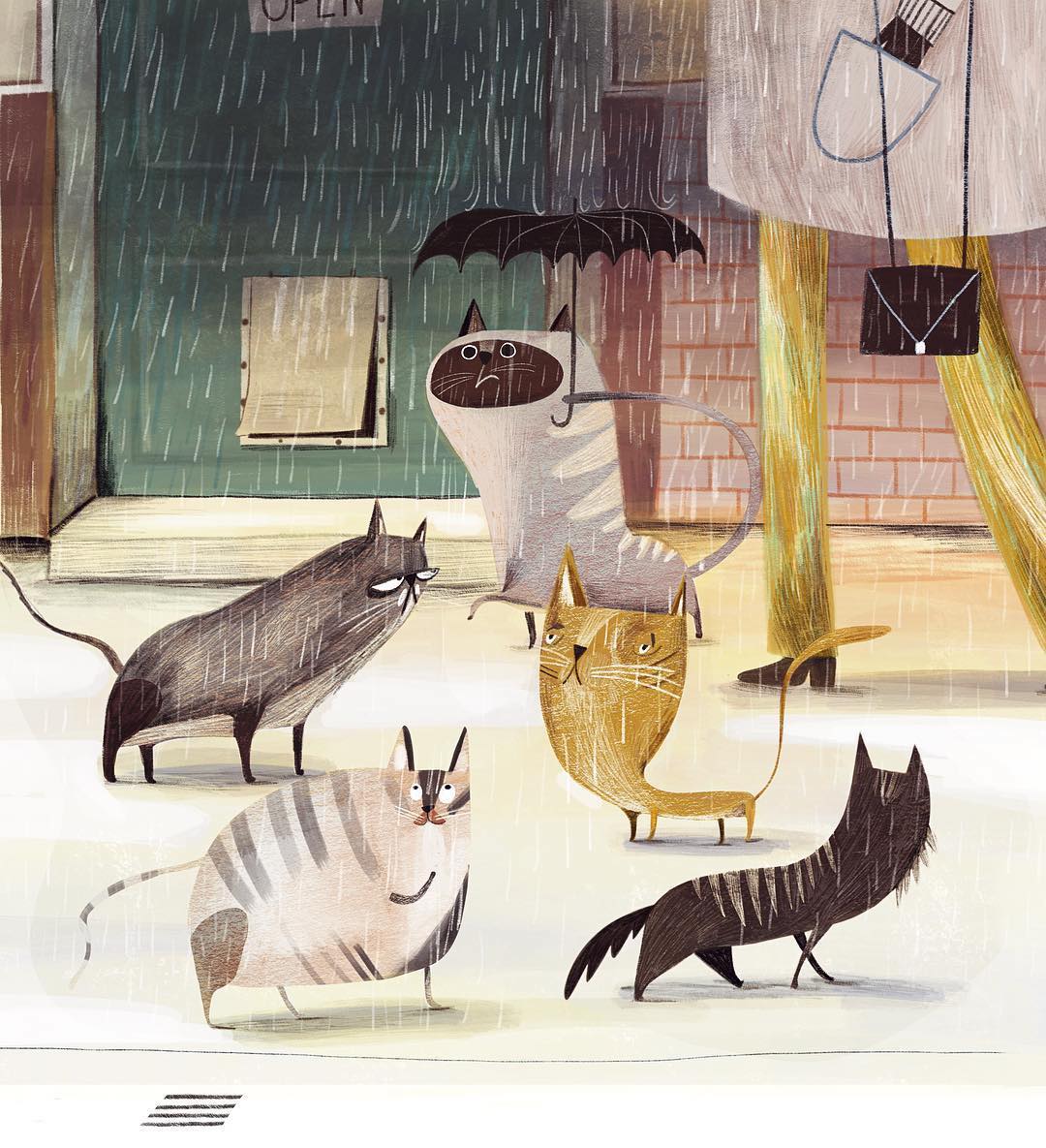
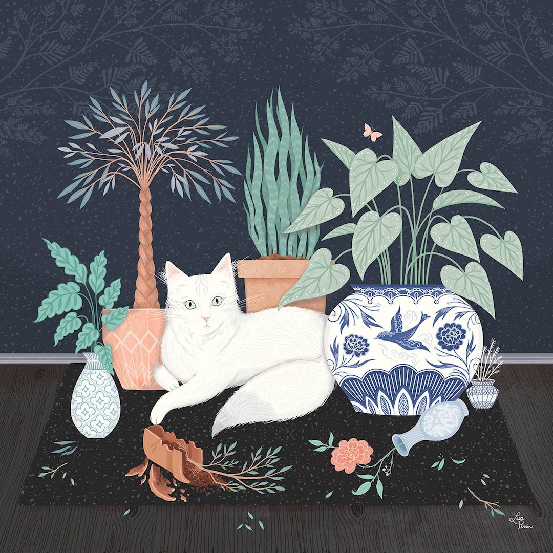
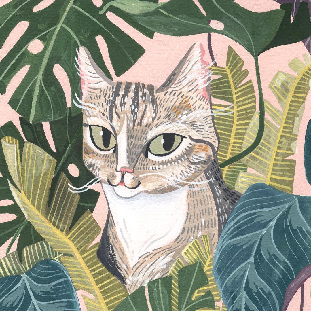
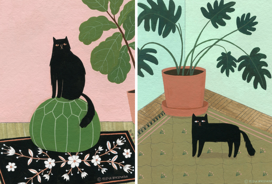
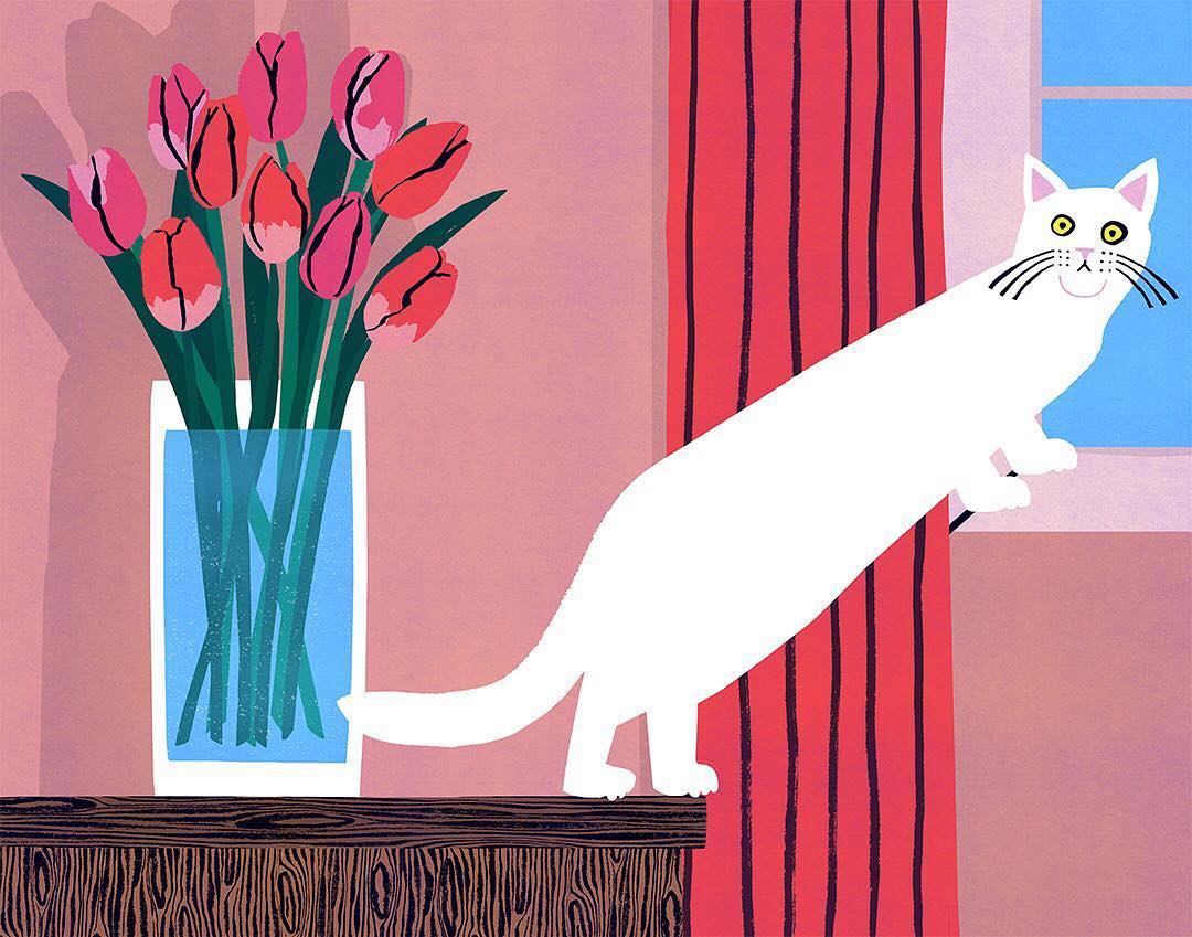
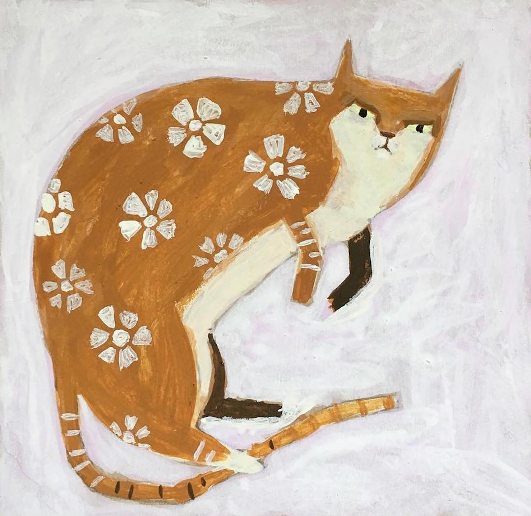
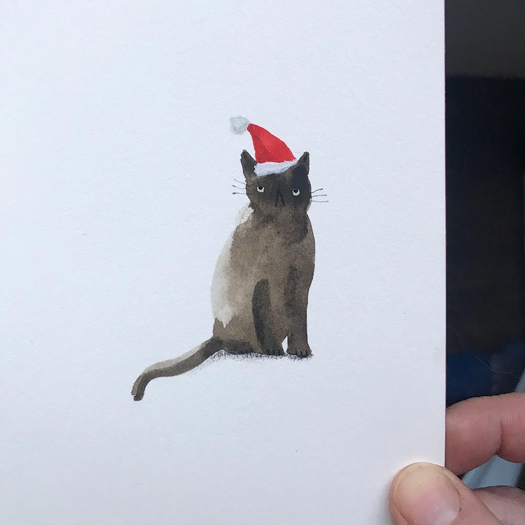
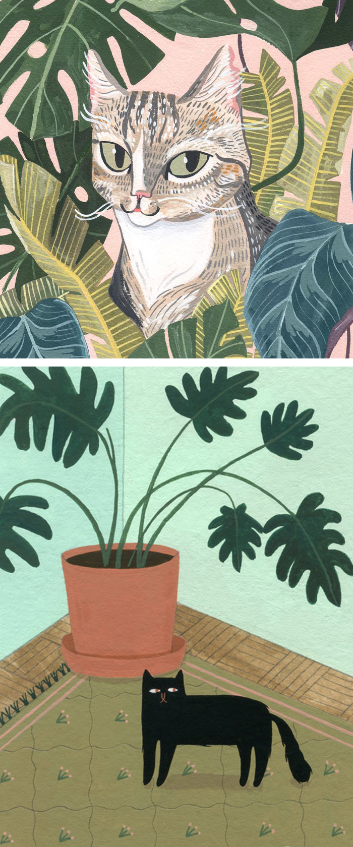
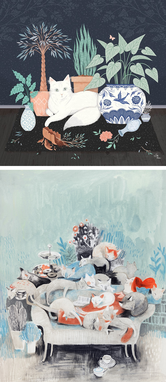
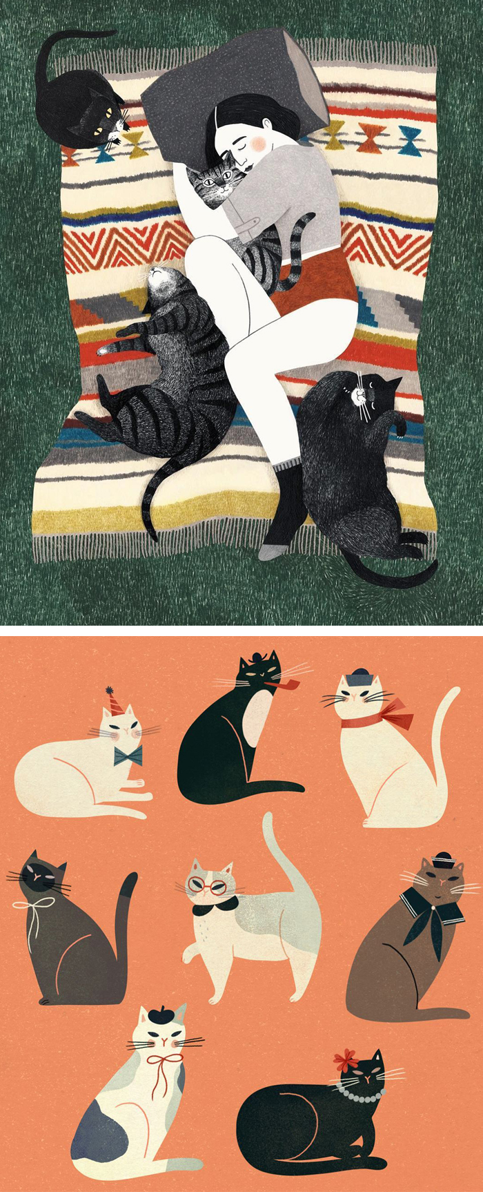
15 Cat Illustrations Celebrating Fabulous Felines of All Shapes and Sizes
----
15 Cat Illustrations Celebrating Fabulous Felines of All Shapes and Sizes
// Brown Paper Bag
Over on my Instagram, #Caturday is my favorite day of the week. It's the day when I specifically celebrate pretty kitties and all their fluffy glory. Today, I'm bringing the party over here with 15 cat illustrations of felines of all shapes and sizes. From fuzzy bellies to fancy hats, artists and illustrators know better than anyone how to pay homage to these adorable animals.
The post 15 Cat Illustrations Celebrating Fabulous Felines of All Shapes and Sizes appeared first on Brown Paper Bag.
----
Read in my feedly
Friday, December 22, 2017
Holiday Greetings
----
Holiday Greetings
// Deja View
I don't know how far these marvelous Christmas cards by Mary Blair date back, my guess would be the 1960s. Her flat style with its geometric shapes reflects a mid-century modern style, but by now it looks timeless to me, because of its ultimate appeal.
I love the character illustration in this add. Minnie Merrell made somebody happy with a one year subscription gift for Walt Disney's Comics and Stories way back in 1939 or 1940.
If current representations of the classic Disney characters could look only half as charming.
Images Heritage Auctions
----
Read in my feedly
J.R.R. Tolkien Is Our Favorite Father Christmas
----
J.R.R. Tolkien Is Our Favorite Father Christmas
// Atlas Obscura - Latest Articles and Places
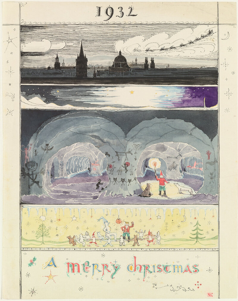
On December 24, 1920, J.R.R. Tolkien sat down in his study and wrote a letter to his three-year-old son, John, who had recently asked about Father Christmas. In spidery handwriting, in red ink, Tolkien replied as Father Christmas (the English folkloric figure now widely equated with Santa Claus), addressed from "Christmas House, North Pole."
The accompanying picture that he drew is charmingly Tolkien-esque. A red-coated figure with a long white beard and a rosy red nose walks through the snow. His dome-shaped house glows from a wintery hillside, at the end of a staircase lit with lanterns.
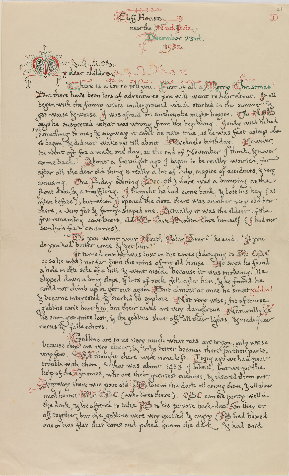
For the next 23 years, every Christmas Eve, Tolkien wrote a letter to his four children from Father Christmas. What began as short, informative letters—"I am just now off to Oxford with a bundle of toys"—evolved into longer tales about life at the North Pole. The 1932 letter begins, "Dear Children, There is alot to tell you. First of all a Merry Christmas! But there have been lots of adventures you will want to hear about. It all began with the funny noises underground ... "
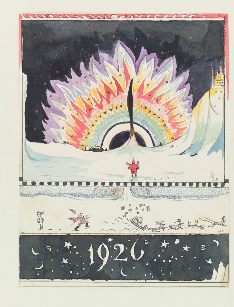
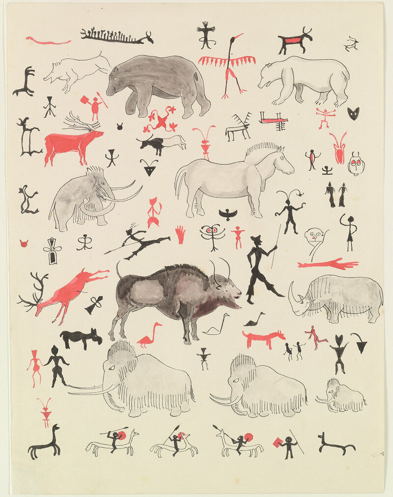
What follows is a tale of a beloved polar bear, mysterious caves filled with goblins, and their heroic counterparts, the Red Gnomes. As with The Hobbit, which Tolkien wrote and published in this period, the letters contain entire worlds, with invented languages and histories, alongside detailed illustrations.
Even the methods of delivery for the letters were as authentic as possible. They were presented to his children in envelopes with North Pole postage stamps—two kisses per letter—and later Tolkien persuaded the postman to include them in his mail deliveries.
Next year, you will be able to see these letters at Oxford's Bodleiean Libraries exhibition Tolkien: The Maker of Middle-Earth, along with a trove of other Tolkien artifacts. Atlas Obscura has some images of the letters, which will be on view from June 1 through to October 28, 2018.
----
Read in my feedly
Sunday, December 17, 2017
More Early Black Cauldron II
----
More Early Black Cauldron II
// Deja View
Certain items from the recent Heritage Auction brought back a lot of memories. Look at this dynamic pastel by Mel Shaw, Mel's room was filled to the brim with extraordinary artwork like this. He must have created hundreds of images for The Black Cauldron. One of the most prolific Disney artists I have ever encountered.
These were the days when the studio had several unique artists trying out for the film's character designs. The original idea was noteworthy, a new fresh style might have been the result.
Before I started on the movie, Milt Kahl, who had left the studio after The Rescuers in 1976, was approached to help out with character concepts. At that time Milt lived in Marin County, just north of San Francisco.
I remember during my first visit, he showed me prints of the designs he had come up with.
Milt said that these kind of characters would be easy for him to animate, but that the studio at the time didn't have artists with the kind of caliber to pull this off. He was right.
But the question remains: Should we even have bothered trying for the Milt Kahl Disney house style?
After all, Tim Burton was working feverishly to present his unique vision for the film.
I don't think I ever mentioned that Marc Davis also contributed design ideas. These sketches lack the graphic "bite" Marc was known for, but his staging is still beautiful.
----
Read in my feedly
scientificillustration: On the Habits, Structure, and Relations...
----
scientificillustration: On the Habits, Structure, and Relations...
// Art and Reference point
On the Habits, Structure, and Relations of the Three-banded Armadillo (Tolypeutes conurus, Is. Geoff.) By Dr. James Murie F.L.S., F.G.S., &C.
----
Read in my feedly
Wednesday, December 13, 2017
Tuesday, December 12, 2017
Saturday, December 9, 2017
What about that rule?
----
What about that rule?
// Gurney Journey
 |
| Dean Cornwell |
Given that you are a huge fan of Howard Pyle (as am I!) there is the principle that he and many illustrators since have talked about.
 |
| Walter Appleton Clark |
Hi, Limn,
Wow, that is a very striking and memorable image, and you're right: it doesn't really follow the Pyle / Loomis rule. This one is successful, but maybe not so much in a poster-like way. It seems to depend on mystery and suggestion, achieved through gradation and close values. The values are definitely low key as you say, and the image would probably work best when not surrounded by bright white computer screen.
-----
Previously: Cure for Middle Value Mumbling
----
Read in my feedly
Friday, December 8, 2017
Sunday, December 3, 2017
The Splitting Image of an Artist
----
The Splitting Image of an Artist
// Print Magazine
The caricaturist and satirist Roger Law, who created the works below, has shifted gears—or, rather, split his image—in the years since his biting satiric TV show, Spitting Image, closed the curtain.
From this:
… To this:
His most recent exhibition of ceramics, drawings and sculpture are on view in London at Sladmore Contemporary from Dec. 6–24. See more of the work here.
Discover all the features of the newest version of single-user font manager, Suitcase Fusion, in this free (!) live webcast on Dec. 7. Reserve your spot today!
The post The Splitting Image of an Artist appeared first on Print Magazine.
----
Read in my feedly
Flagg's Poster "Tell That to the Marines"
----
Flagg's Poster "Tell That to the Marines"
// Gurney Journey
James Montgomery Flagg is best known for his poster of Uncle Sam pointing and saying "I want YOU for the U.S. Army."

He painted many other recruitment posters for World War I, some of which were staged as publicity stunts.

He set up his oversize canvas in New York City and climbed up a ladder as a model stood on a box.

The steps of the New York Public Library became the main location for these events. On some occasions, Flagg would offer to draw a portrait on the spot of anyone who pledged to buy a $1,000 Liberty Bond.
A platoon of Marines with fixed bayonets marched around him. The poster proved so popular that Al Jolson wrote a song based on the line "Tell That to the Marines."

----
Read in my feedly
