Wednesday, August 30, 2017

What Lies Beneath


----
What Lies Beneath
// Muddy Colors

By Justin and Annie Stegg Gerard


This weekend Annie will be doing an oil painting demo on how she adds color glazes over an underpainting. So for today's post I thought I would show a few peaks at her process as well as some of her thoughts on colorizing an underpainting. 


So why bother with an underpainting?  Painting an underpainting takes a lot longer than getting right into the full painting and so it can feel like an overly laborious and redundant step.  But while it does tend to take longer, it offers the advantage of allowing you to concentrate on value and color independently of one another, so you can devote their full attention to each in turn.

Underpaintings also allow the artist to take advantage of one of the curious properties of oil painting: That each layer glazed onto the surface adds greater depth and translucency to the surface of the image.  This has the affect of making things like skin, look like, well, skin. Making this a wonderful;y useful technique for portraiture.


It can be intimidating to add color once you've finished an underpainting. You have to take a pristine monochrome that could almost be a framed finished painting on its own, and now you have to deface it with bold strokes of color.  It can initially be very intimidating.

Thankfully in oil you can simply start splashing color on, and if it looks wrong, you can wipe it out, without affecting your underpainting. This means that you can be very bold with initial choices.


For her underpaintings, Annie uses Raw Umber and Titanium White, with very little medium. (It's important to use very little medium in the underpainting, otherwise the image may not be fat over lean and the later layers may not be stable).  Before moving on to color Annie will allow the painting surface to become completely touch dry.  


For those of you who will be attending DragonCon in Atlanta this Labor Day weekend, Annie's demonstration is Saturday, September 2. It will be at 1PM in Grand Hall D of the Hyatt. 
Here is a preview of the painting she will be working on: 


----

Read in my feedly


Sent from my iPhone

Sunday, August 27, 2017

hideback: Albert Gleizes (French, 1881-1953) Cubist Views of...


----
hideback: Albert Gleizes (French, 1881-1953) Cubist Views of...
// The Curve in the Line


hideback:

Albert Gleizes (French, 1881-1953)

Cubist Views of Brooklyn Bridge, 1915-1917


----

Read in my feedly


Sent from my iPhone

Friday, August 25, 2017

hideback:Illustrations by Gösta Adrian-Nilsson (“GAN”) (Swedish,...


----
hideback:Illustrations by Gösta Adrian-Nilsson ("GAN") (Swedish,...
// The Curve in the Line


hideback:

Illustrations by Gösta Adrian-Nilsson ("GAN") (Swedish, 1884 - 1965)


----

Read in my feedly


Sent from my iPhone

Arkhipov's Washer-Women


----
Arkhipov's Washer-Women
// Gurney Journey

Abram Arkhipov (Russian, 1862-1930) did two versions of his famous paintings of washer-women. 


His first version of 1899 came after a tireless search through different wash houses, where he observed the characteristic movements and the quality of light streaming through the window.

Then, at a wash-house in the Smolensk market in Moscow, he noticed an old woman sitting off to the side, her head resting in her hand, and her right arm resting on her knee. 


The second picture brings the figures closer and lights them more prominently. He was moved by the spirit of hopelessness and exhaustion, which gave the painting a social message as well as an aesthetic one. 
-----

----

Read in my feedly


Sent from my iPhone

From Story Sketch to Final Frame


----
From Story Sketch to Final Frame
// Deja View


It's always interesting to compare a story sketch to the way the final film frame turned out.
If you take story man Bill Peet's work, you'll find out that layout and animation poses are extremely close to what need up on the screen. That's because Peet gave a lot of thought in his sketches regarding character personality, scene continuity and overall staging.
Because of this the animators loved working from his story drawings, the scenes were practically half done.
The scene above was animated by Frank Thomas.

Next up is John Lounsbery with his beautiful animation of Madame Mim as a rhino and Merlin as a crab.


Eric Larson animated Mim as a dragon. Here she finds out that she cought a virus named Merlin.


Other story artists were often less thoughtful when it came to posing the characters or good staging in general. I have copies of some of the storyboards for the animated sections of Bedknobs and Broomsticks. Here the animators had their hands full in translating the story sketches into quality images for the final animation.


----

Read in my feedly


Sent from my iPhone

Don't forget the second step


----
Don't forget the second step
// Seth Godin's Blog on marketing, tribes and respect

The first step is learning how to do it. Finding and obtaining the insight and the tools and the techniques you need. Understanding how it works.

But step two is easily overlooked. Step two is turning it into a habit. Committing to the practice. Showing up and doing it again and again until you're good at it, and until it's part of who you are and what you do.

Most education, most hardware stores, most technology purchases, most doctor visits, most textbooks are about the first step. What a shame that we don't invest just a little more to turn the work into a habit.


----

Read in my feedly


Sent from my iPhone

Raphael’s Drawings at the Ashmolean Museum, Oxford


----
Raphael's Drawings at the Ashmolean Museum, Oxford
// Black Gate

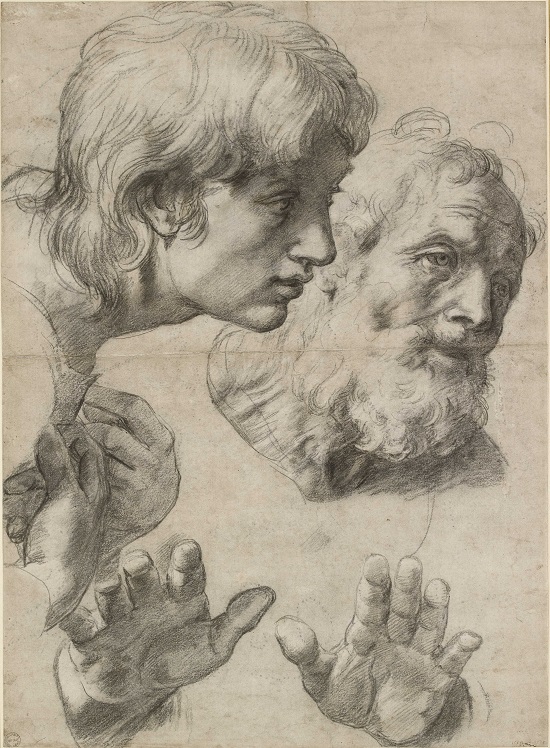
23. Two Apostles (c) Ashmolean Museum, University of Oxford

The heads and hands of two apostles, c. 1519–20.
Black chalk with over-pounced underdrawing
with some white heightening.

One of the highlights of my regular stays in Oxford is visiting the Ashmolean Museum. With its fine collections of all periods, especially Medieval Europe and Ancient Egypt, it's a place I and my family keep going back to. It also has excellent special exhibitions. I wrote up last summer's exhibition on Underwater Archaeology for Black Gate, and this year we got to enjoy the treat of studying some little-seen drawings of an Italian Renaissance master.

Raphael: The Drawings brings together 120 rarely seen works by the Italian master, including 50 from the Ashmolean's collection, the largest and most important group of Raphael drawings in the world. They came to the museum in 1845 following a public appeal to acquire them after the dispersal of the collection of the portrait painter Sir Thomas Lawrence (1769–1830), who had amassed an unrivalled collection of Old Master drawings. A further 25 works are on loan from the Albertina Museum in Vienna, which will show the exhibition in autumn 2017. The remaining drawings come from various international collections.

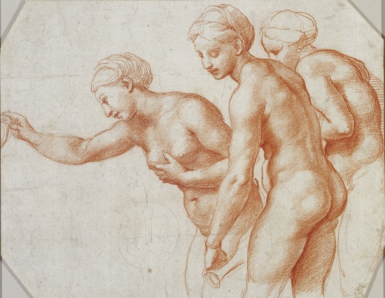
The Three Graces

Study for the Three Graces, c. 1517–18 Red chalk over
some blind stylus. © The Royal Collection Trust,
HM Queen Elizabeth II.

The drawings range in date from Raphael's early career in Umbria through his radically creative years in Florence to the apex of his career in Rome, working on major projects such as the Vatican frescoes.

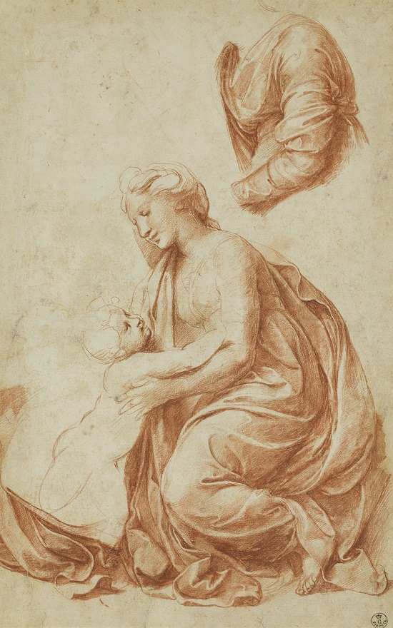
I must admit that as a non-artist much of the subtlety of this exhibition was lost on me. I could only gape at the detail of the lines and the almost magical effect of some of the techniques he used to create shading and light. One of the things I found interesting was how his drawings often had more detail and more refined techniques than his finished paintings, such as the details of the drapery on the Madonna in the Studies for the Madonna of Francis I (c. 1518).

19. Madonna of Francis I (c) Gallerie degli Uffizi, Gabinetto dei Disegni e delle Stampe, Florence

Studies for the Madonna of Francis I, c. 1518 Red chalk
over blind stylus. 
© Gallerie degli Uffizi, Gabinetto
dei Disegni e delle Stampe, Florence.

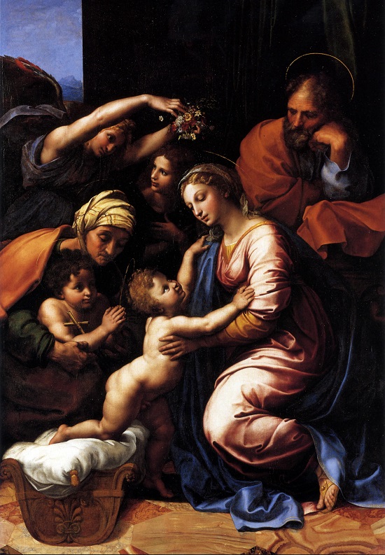
The_Holy_Family_-_Rafael

The final painting that same year. Much of the work was
possibly done by his workshop assistants and not Raphael
himself. Image courtesy Wikimedia Commons.

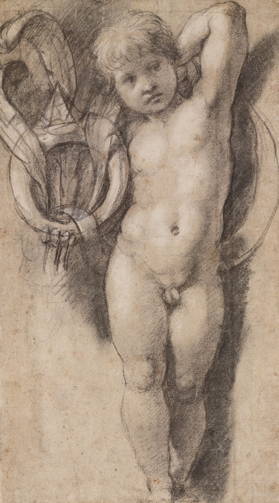
15. Putto (c) Teylers Museum, Haarlem

Putto holding the Medici Ring, c. 1513–14 Black chalk with
white heightening, later framing lines in black chalk.
© Teylers Museum, Haarlem.

Raphael used a variety of media including charcoal, earthy chalks, ink, and metalpoint. The exhibition includes a small display of these tools for those of us who can't draw a straight line. I finally found out what gum arabic looks like and what it's used for. It had always been one of those terms I occasionally heard but had never bothered looking up.

Raphael himself realized that his drawings were more than mere preliminary sketches. He knew they had artistic value in their own right and presented them to such prestigious figures such as Duke Alfonso d'Este and Albrecht Dürer. We're lucky he did, and we're lucky the recipients realized the value of these drawings too and preserved them.

Raphael: The Drawings runs to September 3.

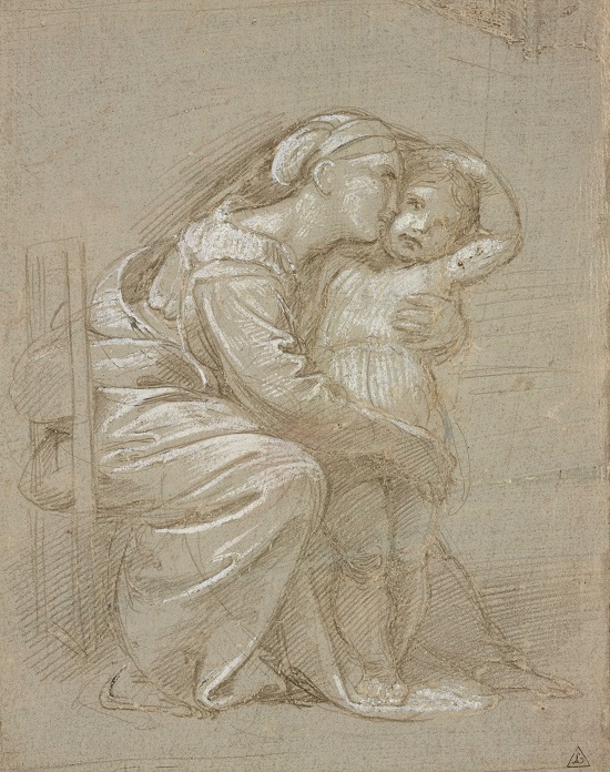
11. Mother & child (c) Ashmolean Museum, University of Oxford

A seated mother embracing her child, c. 1512 Metalpoint with white
heightening on grey prepared paper, selectively indented for transfer

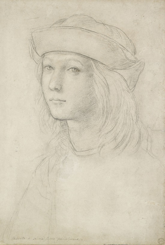
1. Youth (c) Ashmolean Museum, University of Oxford

Portrait of a youth (self-portrait?), c. 1500–1 Black chalk
on white heightening, now largely lost.

Images copyright The Ashmolean Museum, University of Oxford, unless otherwise noted.


Sean McLachlan is the author of the historical fantasy novel A Fine Likeness, set in Civil War Missouri, and several other titles, including his post-apocalyptic series Toxic World that starts with the novel Radio Hope. His historical fantasy novella The Quintessence of Absence, was published by Black Gate. Find out more about him on his blog and Amazon author's page.


----

Read in my feedly


Sent from my iPhone

Wednesday, August 23, 2017

En L'an 2000


----
En L'an 2000
// Voyages Extraordinaires

En L'An 2000 (English: In the Year 2000) were a series of cigarette cards produced in France at the turn of 1900. The initial series was released between 1899 and 1901, in conjunction with the 1900 Paris Exposition Universelle, when excitement about the advancements of the coming century were accelerating. A second series was produced in 1910. For the most part, the series is a fanciful
----

Read in my feedly


Sent from my iPhone

Five Tips to Drawing the Figure


----
Five Tips to Drawing the Figure
// Artist's Network

Figure drawings and sketches by Ilya Repin.

Figure drawings and sketches by Ilya Repin. Article contributions from Mark Gottsegen and Bill Tilton

Easy Ways of Making Figure Drawings

When you get comfortable creating figure drawings or sketchings, you watch your whole world change. Every person — waiting in line in front of you, sitting at a table across from you at a cafe, on the bus or passing you on the sidewalk — is a figure waiting to be captured in your sketchbook. To put you at ease and in the rhythm, so you can start to fill up page upon page with sketches, here are five tips you will want to learn about simplifying the shapes of the parts of the body. From there, you'll find every figure much easier to draw.

Hands Off

Use your non-drawing hand as a model to practice creating gesture sketches. You can also use an ordinary mitten as a model to capture the essential mass of the hand. Try drawing the mitten in a number of positions, then divide this mass into four fingers.

Out on a Limb

Practice drawing the basic arm and leg structures by thinking of them as cylinders. Initially, ignore any details that change with your viewing angle. Drawing from life is always the best approach, but if you don't have a model handy, try substituting sections of PVC pipe, straws connected by modeling clay or pipe cleaners.

Sketch by Linda Capello

Sketch by Linda Capello

Body Art

Use the peanut shape to quickly construct a human or animal figure in any position. Then simply refine this basic shape with details. To better capture this shape, try making a model out of foam rubber, clay or another pliable substance. This model can be twisted or bent into any position for drawing.

Happy Feet

To get the basic form and positioning for feet, draw them as a three-dimensional, rectangular form similar to a brick. Practice drawing them in perspective and in a variety of positions.

Get Ahead

Initially, avoid getting enmeshed in the features and other details of the head. Instead, practice representing the head using a ball for the main portion of the skull and a bucket shape for the jaw.

When you find yourself doing this automatically, begin lightly indicating the shape and position of the nose, eyes and ears.

Once these are in place, draw the nose more definitely and add the mouth, relating its size and placement to the bottom of the nose and the bottom of the chin.

Next, add the eyes, relating them to the width of the mouth. Finally, sketch the ears, using the eyes and nose to gauge the proper size and position.

The Best Way Forward

Spend 10 minutes sketching people passing by. Then the next time make it 15 minutes. Then 20. Start tacking on the minutes but the consistent rule is don't stop. Fill the page! And then another! Soon the figure drawings will flow, especially if you couple that sketchbook time with all the lessons and fun exercises Brent Eviston teaches you in Figure Drawing Essentials: Getting Started with Gesture & Shape. Get Figure Drawing Essentials now and enjoy!

Show off what you've done by tagging your work #artistsnetwork! We are excited to see what you've been working on in the studio and in the pages of your sketchbook!

Courtney

The post Five Tips to Drawing the Figure appeared first on Artist's Network.


----

Read in my feedly


Sent from my iPhone

Tuesday, August 22, 2017

Milt's Brom Bones


----
Milt's Brom Bones
// Deja View


This is the official clean up model sheet for the character of Brom Bones. He appeared in the Legend of Sleepy Hollow section of the 1949 film The Adventure of Ichabod and Mr. Toad.
Milt Kahl supervised the animation of this character. I call this perfect casting, even though he probably would have preferred to animate Ichabod, a much cartoonier character. Milt had this uncanny capability for combining realism with cartoony elements, in regards to design as well as animation. He just knew instinctively how to apply correct anatomy to a cartoon character.
These clean up drawings on the sheet are based on Milt's rough animation. The clean up artist was Iwao Takamoto.
Next up are a few of Milt's roughs.


Here is a previous post on From Bones:


----

Read in my feedly


Sent from my iPhone

Marshall Arisman’s Spiritually Mixed Media


----
Marshall Arisman's Spiritually Mixed Media
// Print Magazine

Marshall Arisman has been an illustrator, painter, sculptor, novelist, storyist, filmmaker and teacher. He's also one of my oldest friends (I knew him when I was 17; he threw me out of SVA when I was 18 and asked me to teach in his MFA illustration program when I was 19). He is an artists' artist. He is a seer and visionary. He is a master maker and thinker. On Aug. 22 his retrospective Marshall Arisman: An Artist's Journey From Dark to Light, 1972–2017, curated by Francis Di Tommaso, opens at the School of Visual Arts (SVA) Chelsea Gallery. (Stunning catalog is available at the exhibit.)

I imagine most of the thousands of students he's guided and mentored over the years will pay homage before the show ends on Sept. 16. I spoke to him recently about what they'll be paying homage to.


What part of your career does this show represent?
The exhibition is a retrospective of the work I have done in illustration and fine art from 1972–2017. The show also includes 18 short stories on video. The videos (1–4 minutes in length) reflect the subject matter dealt with in the show.

Can you point to the part of the exhibit that has the most meaning for you at this time?
To try to pull out one section of the show as more meaningful than any other would be difficult for me. I see it as a whole, hopefully reflecting the title of the exhibit, "An Artist's Journey From Dark to Light." In earlier years, my subject matter was mostly dark, but with time and developing more skill in paint, and more life perspective, I could see that dark and light were on a continuum, that nothing was just dark or light. There was even room on the continuum for humor—lightness with an edge of dark.


In putting this show together, I have come to realize that my content is consistent regardless of the form—illustration or fine art. And my hope is that viewers will see the consistency as they move through the exhibit and that they will understand that the process of creating for the gallery wall and the printed page both reflect my thoughts, ideas and perceptions of the time in which they were created. Often doing a painting will spark an illustrative idea or, equally, fulfilling the limits of creating an illustration will demand taking an idea further in a painting. Exploration of an idea sometimes can't be done in a single image. The reason I develop visual essays and work in a series is that I can dig deeper in the content. In illustration there is simply not enough time. The emotional qualities that can be explored in a series are not possible to sum up in a single page. Doing an illustration or making a painting are both opportunities to tell a story that I need to tell.

To quote Studs Terkel: "People are hungry for stories. It's part of our very being. Storytelling is a form of history, of immortality, too. It goes from one generation to another." For me, illustration is not a way to support my "true art," but in fact it is a way to complete a story. It is not that illustrations can't handle emotional truth, but I believe that in painting, there is freedom to express emotions fully. Particularly in the earlier work, the market for editorial illustration allowed for imagery that was closer to representational painting. Today, for the most part, telling the stories I want to tell need to be done in forms other than illustration. It is the reason for me to expand into film and video as well as continuing to draw and paint.


You have walked the fine line between illustration, performance and "fine art." How have you stayed on your feet without losing creative balance?
The real answer to your question should come from my grandmother, Louise "Muddy" Arisman. Muddy was my childhood mentor. She was also an artist, a medium and a Spiritualist minister. When I told her I was a Libra, and that my astrological sign meant I was balanced, she said, "Dear—you would kill someone to avoid losing your balance." That may be true. I have, however, learned—sometimes, the hard way—to only take work that has meaning for me. I have tried to blur the line between art as a commodity and art that feeds my soul. It has been a luxury for an illustrator to be given the opportunity to do work in illustration with difficult subject matter. That has been to the credit of art directors and publications with courage and commitment to serious imagery. It was difficult in the '70s and is even more difficult today. As for my personal art, it is for myself. I have been fortunate that there are a few collectors who share my vision. As for "performance," it's comic relief from the weightier aspects of daily living; it's also an excuse for me to play the saxophone.

How has the curator, Francis Di Tomasso, organized the exhibit?
When Anthony Rhodes, the executive vice president of The School of Visual Arts, agreed to hold a retrospective for me at the SVA Chelsea Gallery, I knew I needed a curator. I approached Francis, who has a strong history of curating shows for the gallery. An artist himself, I felt he would organize the work into an interesting show. There is a flexible timeline between the illustration and the fine art. The center of the main room is a sculpture installation titled The Monkey Bathhouse. The monkeys are surrounded by my series on Hiroshima and the nuclear holocaust, along with drawings featuring guns. The second room is a walkthrough cave with another series on Angels and Demons, digitally enlarged to six feet. My grandmother's quote is on the wall: Learn to Stand in the Space Between Angels and Demons. The third room features my Ayahuasca Series. It includes large drawings and shadow boxes. The fourth space is a small screening room where 18 short videos I made about the art in the show play on a loop.

Throughout the exhibition are videos that reference various art projects: Printed Matter, a Timeline, a series called Rainbow Dancers and others. Original art done for magazines, book jackets, etc., are displayed with printed tear sheets. A 14-minute video of printed matter, other book projects along with visual essays can be viewed. Thanks to Francis and his brilliant staff, walking through the gallery is a way of experiencing the work of this period as a whole rather than seeing it in fragments.

What is missing, if anything?
The only thing missing is that I threw you out of SVA when you were 18—but that's another story.


Get the Latest Issue of PRINT, Focused on All Things Typography

  • Jessica Hische and 9 other brilliant women ruling type and lettering today
  • The top 25 American type masters
  • Twelve overlooked typefaces you should be using
  • Inside Monotype and MIT's research lab
  • Tattoo artist as typographer?
  • Debbie Millman pens a love letter to Louise Fili
  • And much, much more.

The post Marshall Arisman's Spiritually Mixed Media appeared first on Print Magazine.


----

Read in my feedly


Sent from my iPhone

Minimal: The art of Sebastián Dufour


----
Minimal: The art of Sebastián Dufour
// Muddy Colors

-By Julian Totino Tedesco


One of the things that I was hoping for when I was invited to be a part of the MC staff was to, every once in a while, share the work of artists from my corner of the world; namely, Argentina.


While there are many argentine artists working for the US and European market, I thought it would be more interesting to showcase the work of those who, by working mainly for the local market, might not get much exposure outside the region.

Such is the case of Sebastián Dufour, and for those of you who didn't know his work, you're very welcome.

Sebastián works as an illustrator for local magazines and newspapers, and I became obsessed with his work since I saw it for the first time, many years ago.


Why did I became obsessed? Well, despite the obvious quality of his work, what struck me the most (and still does) is how he manages to boil down the information to the minimum possible detail.


This is especially remarkable when doing portraits, where he manages to get a likeness with just a few strokes.

John Lennon.
The Beatles.


Pete Townshend, from "The Who".

Writer Gabriel Garcia Marquez.


Often times, his work takes an almost abstract quality.

From the book "Samurai"
Published by Taeda, 2008.

From the book "Samurai"
Published by Taeda, 2008.

And of course, there's the textures, those wonderful textures...


Sebastian's work has a very unique voice that I thought was worth sharing, hoping that it would inspire you, the same way it inspires me.

As a bonus, here's a video of Sebastián painting a mural inspired in the Disney's animated movie Moana.


To see more of Sebastian's artwork, you can go here

Or you can follow him on Instagram.
----

Read in my feedly

Sent from my iPhone