


Sent from my iPad
Tuesday, April 15, 2014
John Rea Neill (American, 1877 - 1943) "The Sea Fairies" by L.... [feedly]
----
John Rea Neill (American, 1877 - 1943) "The Sea Fairies" by L....
// The Curve in the Line


John Rea Neill (American, 1877 - 1943)
"The Sea Fairies" by L. Frank Baum, 1911
"But I wish I was Flippity," said one of the mackerel, staring at Trot with his big, brown eyes. "He went to glory before I could eat the hook myself."
http://dorothyozma.tripod.com/seaf.htm
----
Shared via my feedly reader
Sent from my iPad
gastrophobia: nightofthecomics: davezissou: Kerascoët’s... [feedly]
----
gastrophobia: nightofthecomics: davezissou: Kerascoët's...
// space in text


Kerascoët's covers for Beauté with scans of the original art for the 2nd and 3rd tomes and the cover design for the first.
I think Kerascoët's use of green ink is very interesting as a way to define lines and spaces meant for color while maintaining information within the image that black ink would otherwise compromise. It's a smart method with using green to define the sky against the cloud and especially with the amount of creatures drawn heavily with black, the green prevents her from losing the shapes and figures to black and also from committing the all too common aural line around figure that would completely destroy the eerie mood of the third cover or the delicate detail of the comb going through black hair in the second.
This book looks great. Please come to America. I don't care if it's translated or not.
Oh my giddy aunt.
I got these books!
PROTIP: Your amazon.com log-in works on the amazon.ca website.
----
Shared via my feedly reader
Sent from my iPad
arquicomics: Mi Nueva York-Brendan Behan / ilustrado por Paul... [feedly]
----
arquicomics: Mi Nueva York-Brendan Behan / ilustrado por Paul...
// space in text


Mi Nueva York-Brendan Behan / ilustrado por Paul Hogarth (ed. Marbot ficción)
----
Shared via my feedly reader
Sent from my iPad
Friday, April 11, 2014
Tweet from Michael Cho (@Michael_Cho)
 | Michael Cho (@Michael_Cho) |
As you evolve and grow out of one form, you find there is a limitless variety of art to learn and draw inspiration from. | |
Download the official Twitter app here
How Not To Make a Graphic Novel « The Hooded Utilitarian
www.hoodedutilitarian.com/2014/04/how-not-to-make-a-graphic-novel
Download the official Twitter app here
Download the official Twitter app here
Wednesday, April 9, 2014
Tuesday, April 8, 2014
Ban Sack [feedly]
----
Ban Sack
// lines and colors
Benjamin Sack creates wonderfully complex large scale drawings of imaginary cities, often in detailed, map-like projections.

There is a fascinating video on YouTube that steps through his process in filling out the drawing shown above, top (with detail).
I particularly like his fun take on Van Gogh's The Starry Night (above, bottom, with detail).
In addition to the portfolio on his website, Sack maintains a blog, and you can also find prints on his society6 page.
There are some photos on this post by Jason Kottke — which is where I learned of Sack's work — that show the scale of one of Sack's drawings. Kottke points out that Sack's work shares come characteristics with the large and detailed cityscapes of Stephen Wiltshire.
----
Shared via my feedly reader
pizza-party: deadcrowcomics: Process gifs are fun to... [feedly]
----
pizza-party: deadcrowcomics: Process gifs are fun to...
// space in text

Process gifs are fun to do….
Process this.
----
Shared via my feedly reader
2B or Not 2B [feedly]
----
2B or Not 2B
// Artist's Network
I recently received a perplexing e-mail regarding the types of pencils I use for my graphite work. I thought I had made that abundantly clear in the many books I have written on graphite drawing. So naturally, the comments they wrote left me scratching my head in confusion.
The writer said that he had tried for months to achieve the look I create in my artwork. Try as he might, he couldn't recreate the very pale tones or get them to blend evenly, his dark areas always seemed disconnected from the other tones, and certain areas appeared to be a different color than the rest. What was he doing wrong? Students ask me this almost daily in my studio, so I wasn't surprised by the question. But, my confusion came in when this person basically said that he didn't believe that my technique is done with one type of pencil, underestimating me and my drawing technique. A mechanical pencil with 2B lead is only what I use for my graphite work.

Me with my favorite pencil. A match made in heaven!
So, to clear this matter up, I'll tell you a little story…
How Lee Hammond Came to Use a Mechanical Pencil For Her Graphite Work
Once upon a time, back in the late 1970's, Lee was working for the Police Department. Not long after completing her forensic training, she got laid off due to budget cuts. Needing a job, she went to work at a local art supply store in the mall. She then remained on call for the police, doing composite drawings.
Lee loved her new job, especially being surrounded by all of the awesome art supplies! It was like being dropped into artistic heaven. Since she had prior experience in retail, and it was nice working with the law-abiding public again. She also liked working during normal business hours, as opposed to working in the middle of the night.
She advanced quickly, and went into management. To be in management, she had to go through a training program with the National Art Materials Trade Association. (NAMTA). Through this program, she learned all about the various art supplies: how they were used, how they were made, and what their chemical ingredients were. It was fascinating, and she soaked up every word of it like an artistic sponge!
Interesting salespeople from different art supply manufacturers often visited the art store. They showed new items going on the market, and even gave away samples, which was very fun and exciting. One day, Lee was describing the graphite art pencils to a customer. At that time, Lee was inexperienced, and was only using techniques she had learned through NAMTA. She was giving her sales pitch about the virtues of all of the different lead hardnesses, ranging from 9B (extremely soft) to 9H (extremely hard). She then gave a little drawing demonstration on how to use them.
While she was drawing, a salesman for the Pentel company came into the store to meet with another manager and go over new products. They invited Lee to the meeting, which was very exciting for an art supply manager and budding artist!
The salesman asked Lee if she had ever used a mechanical pencil before. Back in the 70's, these pencils were mostly used for drafting and book keeping–students weren't even allowed to use them in schools. Lee said no; she had no knowledge of them whatsoever. The salesman went on to inform the group of their usefulness for drawing, and how a customer could save a lot of money just by switching to one. He explained that we only use half of a regular pencil. The first third we actually use, the second third is sharpened away, and the last third becomes too short to comfortably hold on to, so we just throw it away. The managers hadn't thought of what a waste this was before!

The Sharp Kerry mechanical pencil by Pentel. The "Cadillac" of pencils.
The salesman generously gave Lee a set of mechanical pencils that contained a 0.9mm, a 0.7mm, a 0.5mm, and a 0.3mm, and he explained that the 0.5mm was the average size to use. He then gave her a "Sharp Kerry" by Pentel, which is now the famous Lee Hammond pencil you see in her videos. It's the Cadillac of mechanical pencils. (You can find them on Amazon.) One use, and she was hooked! It was perfect for doing her police composites. She could advance the lead with a small click, instead of breaking the witness's train of thought as she stopped to sharpen a pencil.
Oh, but the story doesn't end here! Little did Lee know that she was going to create history with that little pencil. She never anticipated being a best-selling author of art instruction books. Who knew that the "Hammond Blended Pencil Technique" was patiently waiting for her to catch up to it, so it could become the most loved method of graphite drawing.
If you could see Lee's artwork from back then, you would laugh, and feel very good about your own. She was pretty awful, and her drawings looked nothing like they do now. Don't get things wrong though, she was happy at the time. We all go through growing phases. It's a good thing we don't know the future. If the "young Lee" could've seen a glimpse of the "older Lee's" work, she would've become very impatient and unsatisfied with her work back then. She may have even given up. Some of Lee's students feel that way when they watch her draw now. But, at the time, Lee thought she was pretty good, and she was for that stage of the game. (You are too!) But for years, she struggled to perfect her now famous technique. She couldn't seem to get her drawings the way she wanted them. There was a certain look she was trying to achieve; one she saw in her mind's eye. The "Hammond Blended Pencil Technique" was wearing her out, and she didn't even know what is was yet.
These struggles are what makes Lee teach with such patience, because she remembers the feeling of wanting to scream. She remembers what it feels like to struggle and and not know why it isn't working! Lee is self-taught. She had no guidance except for the correspondence course she had taken. She was just a stubborn wannabe artist who refused to give up. To this day, Lee is still trying to get better and better and better and better, and the truth is, she will never stop trying.
So, back to the story. The salesman who gave Lee the mechanical pencils failed to tell her that there were different lead types that she could put in them. Being that he was a salesperson and not an artist, he had no knowledge of what would be good for various types of drawing. All mechanical pencils come with HB lead in them, which is the middle of the road. It's neither hard like the "H" leads, nor soft like the "B" leads. Lee thought, if it's what comes with the pencil, it must be the right lead to use, right? Wrong!
The HB lead, while really good for quick sketches and basic line drawings, isn't soft enough to blend out. Now, Lee knew in her gut that she wanted a smooth, blended look in her drawings, but she had no idea how to achieve it. So, in her struggle, she created a whole new problem for herself.

Drawing with the famous pencil. The one I REALLY use! As you can see, they come in different colors. (My dog Jackie thinks it's pretty cool too!)
The Tortillions (A Common Blending Tool for Drawing)
Oh my, what a mess she made with those little things. She battered and abused them until their ends were frayed and the tips were bent over like stocking caps! In her mind, it was their problem that her work still looked choppy. So, she pushed harder and harder with them to make them move the graphite around! She literally tried to beat them into submission.
The problem wasn't the tortillions; the problem was Lee. She had no clue what she was doing. Over time, she slowed down. (Did I mention that she's stubborn and impatient with herself?) It took her a long while to discover and learn the three most important, key elements to her own technique. They are:
- HB lead is too hard for this method. Lee later learned that you could change the lead in a mechanical pencil, so she started using 2B. Oh, what a difference that made! Holy cow, it was like night and day. The smooth blend she craved magically appeared.
- She learned to be kinder and gentler on the tortillions and stumps. She realized that by pushing really hard, all she was doing was roughing up the paper, and making the graphite imbed itself. (Not to mention she was ruining those precious, little tortillions.) This left rough patches and dark spots. It wasn't until Lee started doing a lot of painting when she realized that to get a smooth blend, you had to use a light touch. When you're painting a wall and you have noticeable brush strokes, you don't push harder on the brush, do you? No–that just makes more brush strokes! To smooth it out you lighten up and feather it. A light blending with a tortillion makes the graphite move around on the top surface of the paper, without roughing it up. Wallah! Smoother blending.
- Lee used to use a basic sketch paper, which is way too thin and rough for the look she wanted to achieve. When she discovered the smooth bristol, after seeing a customer use it at the art store, she realized that her solution had been found. The smooth, heavier paper can really take the blending and erasing, without becoming rough. The heavy weight of it doesn't buckle and accidentally crease when you use it either. And the smooth finish makes the blending look even softer.
That, my friends, is how Lee found her pencil, and how the "Hammond Blended Pencil Technique" was created. Once she got the kinks worked out, her first book, Lifelike Portraits from Photographs was born in 1994, copyrighting the technique. As you can see, it took her almost 15 years to get it right. So, be easy on yourself, OK? The moral of this story is that learning takes time.
Lee still loves her mechanical pencil, and the two of them lived happily ever after!
The End
As you can see, it's quite a story, but hopefully it'll answer some of the questions you may have regarding my technique. I'm not withholding information. I would never do that! I do use the one pencil for just about everything. That said, I do supplement my pencil at times, although it isn't required for my technique. I'll share some additional tricks with you now.
Remember the other mechanical pencils the salesman gave me? I use them, just not as often. For doing really small details such as animal fur, fine hair, eyebrows, and eyelashes, I use my 0.3mm mechanical pencil. Because the lead is so small and delicate, the softest lead you can find for it is "B". The fine lines it creates are perfect for intricate details. I don't mention it in my books, just to make things easier for the reader, for the subtleties would be hard to see in print. It's not required. You can still achieve very fine lines with the 0.5mm pencil if you use a light touch.
I also use the 0.7mm and 0.9mm pencils for larger, more filled in areas, such as very dark backgrounds. Using a soft lead, such as 2B or 4B, you can get things quite dark and cover a larger area using these pencils. Again, the same can be achieved with the 0.5mm, it just takes a lot longer.
2B lead is wonderful, but I've recently been using 4B as well, which is a bit softer, and I like it a lot. But 2B is easier to find, and just as versatile for this technique.
So there! All of my secrets have now been revealed! These are the pencils I really use!
Have a great week!
Lee
Lee Hammond has been called the Queen of Drawing. That may not be fair these days, since in addition to providing the best drawing lessons, she has also created fantastic books and videos filled with the same easy to follow acrylic painting techniques, colored pencil techniques and more. Click here to see all of the instructional books and DVDs that Lee Hammond has to offer!
• Free download! Easy Acrylic Painting Techniques by Lee Hammond
----
Shared via my feedly reader
Sent from my iPad
A Beginners Guide to Light & Shadow – Part 1 – Drawing [feedly]
----
A Beginners Guide to Light & Shadow – Part 1 – Drawing
// will kemp art school
Have you ever been perplexed after working so hard on a drawing that you suddenly see somehow it still looks 'flat' Is it the proportions? The perspective? Perhaps the composition? Whilst these all play an integral part, the most effective method of making your drawings appear 3 dimensional, is understanding how light logic works. If […]
----
Shared via my feedly reader
Sent from my iPad
petitpoulailler: Sir Edward Coley Burne-Jones (British... [feedly]
----
petitpoulailler: Sir Edward Coley Burne-Jones (British...
// The Curve in the Line

Sir Edward Coley Burne-Jones (British Pre-Raphaelite, 1833-98)
----
Shared via my feedly reader
Sent from my iPad
Ten drawings of plants by Ellsworth Kelly [feedly]
----
Ten drawings of plants by Ellsworth Kelly
// Paying Debt to Nature with a Death as Obscure
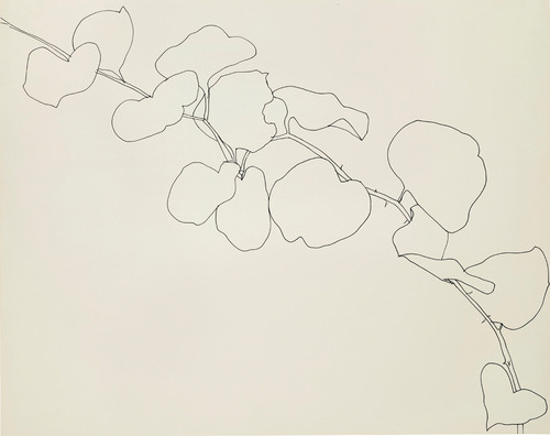
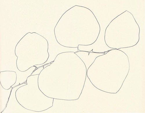
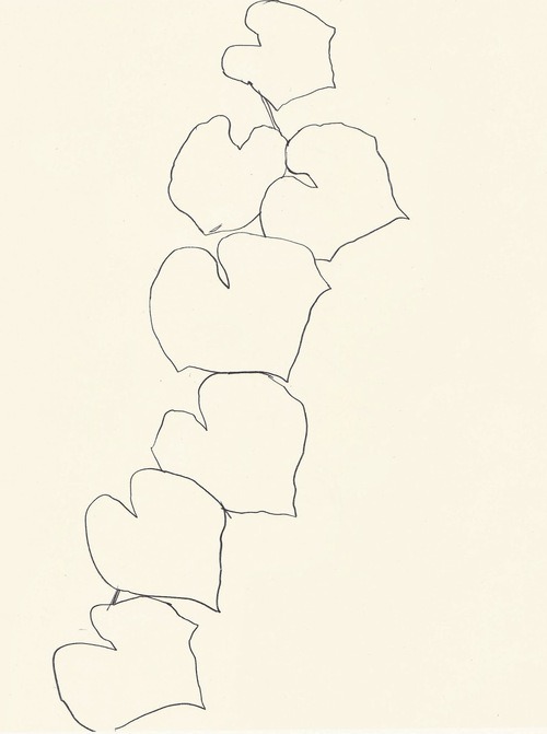
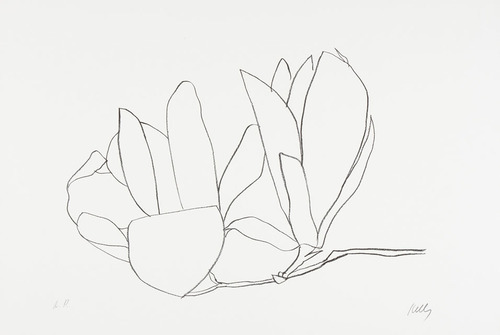
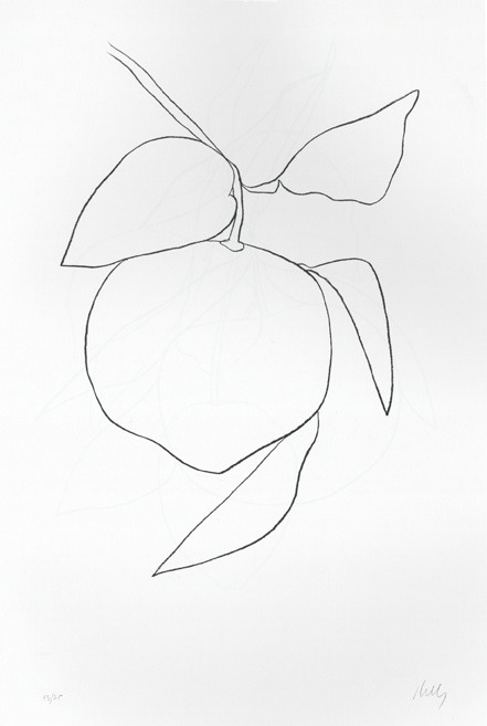
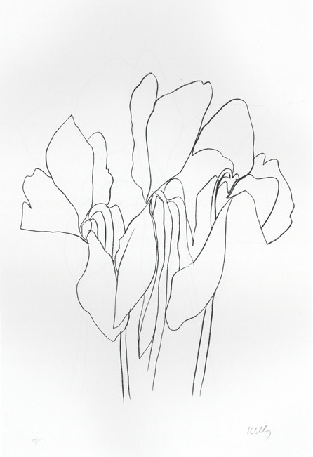
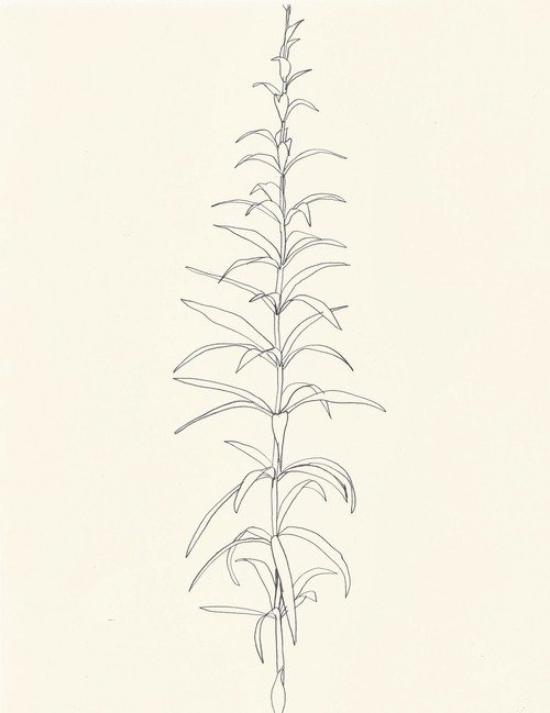
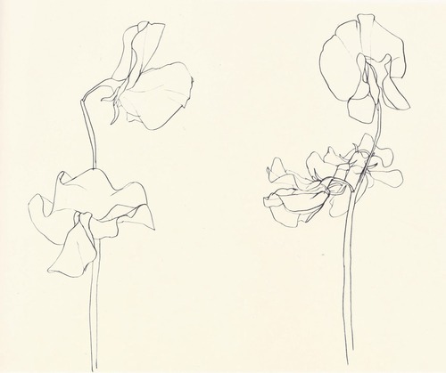
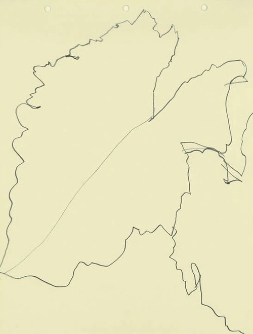
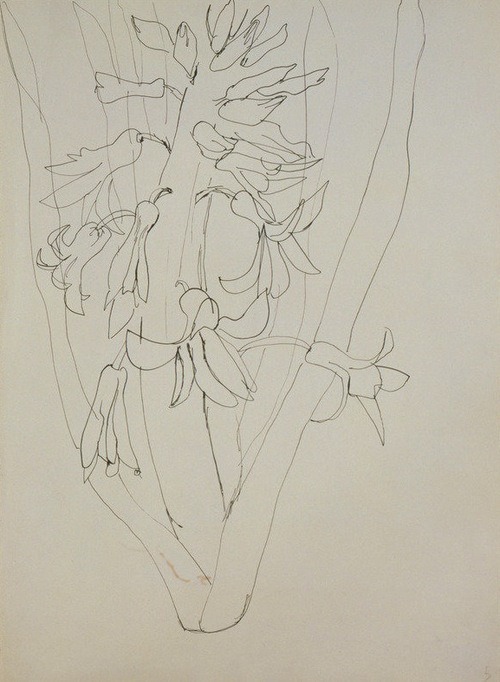
----
Shared via my feedly reader
Sent from my iPad
Monday, April 7, 2014
Thursday, April 3, 2014
Ongoing Homework!
75 pages (roughly a page a day!) in your sketchbook!
This is in addition to a project TBA
I will give you lots of ideas throughout the term and lots of examples of things to try and work with.
The hardest part of this will be the self discipline. Don't let them build up!
I will help you with this as I will be having you hand in your sketchbooks once a week so I can review your progress.
You can draw anything using anything you want, but I highly suggest you try the things I show you and talk about in class!
Listen and take notes.
Build projects!
Don't be afraid to make courageous crazy marks!
Remember: carry your sketchbook with you at all times! use it to fill the corners of your time! Bring it to class always!
FYI: drawings done in class don't count!
P.S. Extra credit for pages beyond 75!

Tweet from lovelifedrawing.com (@live2draw)
 | lovelifedrawing.com (@live2draw) |
#drawingtip 12: go super light with the lines of your first draft. Much easier to change things later. Somehow I can never do this one! | |
Download the official Twitter app here
Wednesday, April 2, 2014
Tweet from The Goal Control (@thegoalcontrol)
 | The Goal Control (@thegoalcontrol) |
"Challenge is a dragon with a gift in its mouth. Tame the dragon and the gift is yours." -Noela Evans #challenge | |
Download the official Twitter app here
Tuesday, April 1, 2014
Tweet from Julia Cameron (@J_CameronLive)
 | Julia Cameron (@J_CameronLive) |
"I don't understand" is not a bad place to be in artistically. Mystery and humility can enter through this willing doorway. | |
Download the official Twitter app here
Tweet from Motivational Tweets (@Tweets2Motivate)
 | Motivational Tweets (@Tweets2Motivate) |
"The greater danger for most of us is not that our aim is too high and we miss it, but that it is too low and we reach it." -Michelangelo | |
Download the official Twitter app here
Monday, March 31, 2014
Jorge Luis Borges, After Going Blind, Draws a Self-Portrait [feedly]
----
Jorge Luis Borges, After Going Blind, Draws a Self-Portrait
// Open Culture
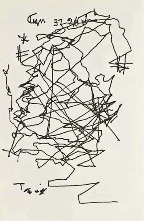
Jorge Luis Borges (1899-1986), one of the great writers to come out of Argentina, went blind when he was only 55 years old. As unsettling as it must have been, it wasn't particularly a surprise. He once told The New York Times, "I knew I would go blind, because my father, my paternal grandmother, my great-grandfather, they had all gone blind."
In the years following that life-changing moment, Borges never learned braille and could no longer read. But he did continue to write; he served as the director of Argentina's National Library; he traveled and delivered an important series of lectures at Harvard on poetry (click to listen); and he even took a stab at drawing — something he did fairly well earlier in life. (See our previous post: Two Drawings by Jorge Luis Borges Illustrate the Author's Obsessions.)
Above, you can see a self portrait that Borges drew in the basement of the famous Strand Bookstore in New York City. According to the Times, he did this "using one finger to guide the pen he was holding with his other hand." After making the sketch, Borges entered the main part of the bookstore and started "listening to the room, the stacks, the books," and made the remarkable observation "You have as many books as we have in our national library."
If you've ever been to The Strand, you know how many books it holds. Indeed, the store boasts of being "New York City's legendary home of 18 Miles of new, used and rare books." My guess is that Argentina's national library might have a few more volumes than that. But who is really counting?
Related Content:
Jorge Luis Borges' 1967-8 Norton Lectures On Poetry (And Everything Else Literary)
Jorge Luis Borges Chats with William F. Buckley on Firing Line (1977)
Jorge Luis Borges, After Going Blind, Draws a Self-Portrait is a post from: Open Culture. Follow us on Facebook, Twitter, and Google Plus, or get our Daily Email. And don't miss our big collections of Free Online Courses, Free Online Movies, Free eBooks, Free Audio Books, Free Foreign Language Lessons, and MOOCs.
The post Jorge Luis Borges, After Going Blind, Draws a Self-Portrait appeared first on Open Culture.
----
Shared via my feedly reader
Sunday, March 30, 2014
Elegant as ever [feedly]
----
Elegant as ever
// Gustaf Tenggren
This image was published in November 29, 1956. The famous Saturday Evening Post Cover with Walt Disney had been published just a couple of weeks ago and the local Maine paper The Boothbay Register was making a visit by the artist. At the time his main scope was to meet the deadline for the 100 full color illustrations for Arabian Nights, that were to be delivered in December.
 |
| Gustaf Tenggren had just recently celebrated his 60 year birthday in November 3, 1956, when this picture was published. He doesn't look too overwhelmed, being disturbed in his work. |
This 60 year old gentleman is painting along in a nice suit and and tie. On the drawing board is one of the stunning pages illustrating a ferocious fight at sea. It all turned out to be one of his most beautiful books ever. Below is the remarkable original, kept in the vaults of Kerlan Collection in University of Minneapolis, Minnesota.
 |
| Full page from Sindbad the Sailor, Margaret Seifer's compilation of Golden Tales from Arabian Nights published by Simon & Schuster in 1957. Kerlan collection of the University of Minnesota Libraries with permissions from the Archives and Special Collections. |
----
Shared via my feedly reader
Sent from my iPad
Bicycle Street Art by Mart [feedly]
----
Bicycle Street Art by Mart
// Colossal


I'm completely in love with these bicycle murals from Argentinian artist Mart who began painting on the streets of Buenos Aires in the 1990s at the tender age of 12. His whimsical imagination is expressed through vibrant colors and stunning line work that flows freely from cans of spray paint. You can see much more of his work on Flickr, and read more about him over on Graffitimundo.
----
Shared via my feedly reader
Sent from my iPad
Subscribe to:
Posts (Atom)