Tuesday, January 23, 2018

If Apples Had Teeth: Shirley and Milton Glaser’s Lovely Vintage Children’s Book About Questioning the Way Things Are


----
If Apples Had Teeth: Shirley and Milton Glaser's Lovely Vintage Children's Book About Questioning the Way Things Are
// Brain Pickings

An irreverent invitation to reconsider the world's givens.


If Apples Had Teeth: Shirley and Milton Glaser's Lovely Vintage Children's Book About Questioning the Way Things Are

The lever by which the human imagination moves the world rests on one little word: if — that linchpin of possibility allowing us to question the way things are and imagine better, truer alternatives for how they might be. "'What if… ?' gives us change, a departure from our lives," Neil Gaiman observed in extolling the power of cautionary questions. "What if there is something I do not yet know?" Tolstoy asked himself in contemplating what gives life meaning. Copernicus toppled God through the implied if of a universe in which we were no longer at the center of significance. Democracy began with the experimental if of a world in which every human being is granted equal opportunity at happiness.

In 1960, more than a decade before he created the iconic I♥NY logo, legendary graphic designer Milton Glaser (b. June 26, 1929) joined forces with his wife, Shirley Glaser, on a series of unusual children's books composed by Shirley and illustrated by Milton, beginning with one that explores that supreme propulsive force of the human imagination.

Shirley and Milton Glaser

Republished for the first time since its original debut more than half a century ago, If Apples Had Teeth (public library) is part poetry, part art, part jubilant nonsense, radiating a simple, playful, yet profound question: Why must things be the way they are, and what if they were otherwise? A century after Mark Twain penned his irreverent Advice to Little Girls, inviting young women to question social mores, the Glasers tug at life's givens with a playful and pleasantly mischievous curiosity kindred to Twain's.

If Apples Had Teeth comes from Brooklyn-based independent powerhouse Enchanted Lion, publisher of uncommonly imaginative treasures like Cry, Heart, But Never Break, The Lion and the Bird, The Paper-Flower Tree, and Bertolt. Complement it with Glaser, older and wiser by half a century, on art, education, and the kindness of the universe.

Illustrations courtesy of Enchanted Lion Books


donating = loving

Bringing you (ad-free) Brain Pickings takes me hundreds of hours each month. If you find any joy and stimulation here, please consider becoming a Supporting Member with a recurring monthly donation of your choosing, between a cup of tea and a good dinner.


newsletter

Brain Pickings has a free weekly newsletter. It comes out on Sundays and offers the week's most unmissable reads. Here's what to expect. Like? Sign up.


----

Read in my feedly


Sent from my iPhone

Eye Candy for Today: Turner’s Bridge in Middle Distance


----
Eye Candy for Today: Turner's Bridge in Middle Distance
// lines and colors

The Bridge in Middle Distance, Charles Mallord William Turner and Charles Turner

Etching, aquatint and mezzotint, roughly 7 x 11 inches (18 x 28 cm).

Link is to zoomable version on the Google Art Project; original is in the National Gallery of
Art, DC
, which has both zoomable and downloadable versions.

As he frequently did, British artist Joseph Mallord William Turner worked with master printmaker Charles Turner (no relation) to produce this beautiful lanscape print.

In this case, JMW Turner designed the image did the primary etching, calling on Charles Turner to apply the tones under his direction using the processes of aquatint and mezzotint.

Aquatint involves coating part of the plate in particles of resin, leaving a granular halftone when the plate is etched in acid. Mezzotint is a process in which the plate, or parts of it, are roughened with a special textured "rocker", leaving a surface that will print as tones that can be burnished to produce variations.

Like most prints, there are multiple impressions of this one; there is another in the Metropolitan Museum of Art.

This was one of seventy plus images for which Turner made prints as part of a collection called "Liber Studiorum" (Book of Studies), intended to demonstrate examples of his ideas about landscape. For another beautiful print from that series, see my previous post: Eye Candy for Today: JMW Turner etching and mezzotint.


----

Read in my feedly


Sent from my iPhone

And Then I Read: MARCH, Book One


----
And Then I Read: MARCH, Book One
// Todd's Blog

Art by Nate Powell, written by John Lewis and Andrew Aydin.

This much celebrated story of the life of John Lewis is moving, and inspiring. Life in the South during Segregation is something I've only read about, or seen in films or TV documentaries. Somehow this illustrated version focused on the life of one boy growing to manhood makes it more personal, more understandable, more outrageous than all the video clips of angry people and heroic marchers can convey. It brings it home to the reader. The boy who loved the chickens he cared for on his parents' farm so much that he couldn't bear to eat them, and who snuck off to school when he was supposed to be helping with the harvest. The young man who helped organize sit-ins at lunch counters in his town that didn't serve people of his color. Taking on the hatred and violence with passive resistance in the spirit of Gandhi. Going to jail for his principles. Gradually gaining some grudging compromises from the town mayor.

Fine work by everyone involved. I look forward to reading the rest. Highly recommended.


----

Read in my feedly


Sent from my iPhone

Thursday, January 18, 2018

Wednesday, January 17, 2018

Found: Two New Drawings by Vincent van Gogh


----
Found: Two New Drawings by Vincent van Gogh
// Atlas Obscura - Latest Articles and Places

article-image

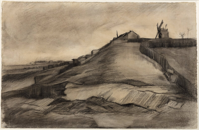
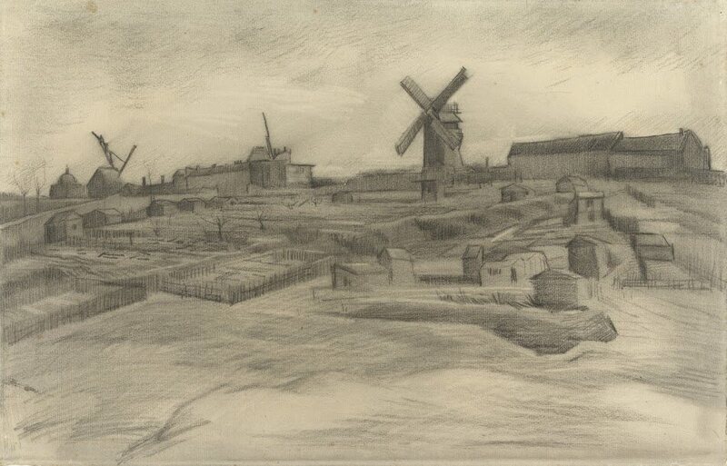
In 1886 and 1887, Vincent van Gogh lived with his beloved brother Theo in an apartment in Montmartre, Paris's iconic hilltop neighborhood famous at the time for its vibrant art scene. That's where he composed a series of works in which he depicted rural subjects such as windmills and vegetable gardens, as well as views of the city skyline that he could see from his window. Thanks to new research from the Van Gogh Museum in Amsterdam, we can now add two more works to the Postimpressionist's Montmartre period.

Hill of Montmartre with Stone Quarry, a 1886 sketch of Paris's heights with a quarry below, was acquired by the Van Vlissingen Art Foundation in 2014. Four years on, experts from the Van Gogh Museum have confirmed that the drawing indeed came from his hand. This, in turn, helped to authenticate another sketch, The Hill of Montmartre, which was held at the museum but had previously been rejected as a Van Gogh—partly because it was so unlike his other work. "It is fantastic news that two drawings can now definitively be added to Van Gogh's oeuvre," said museum director Axel Rüger, in a press release.

article-image

The drawings, which will be featured in a upcoming exhibition at the Singer Laren Museum in the Netherlands, display strong similarities in terms of subject, size, style, technique, and materials. As the Van Gogh Museum's Teio Meedendorp explained in the release, they were composed when the artist was still practicing with traditional techniques—before finding his distinctive style. "They demonstrate a phase in Van Gogh's learning process—in Paris, he rediscovered himself, but here, he was still following the traditional artistic path."


----

Read in my feedly


Sent from my iPhone

Tuesday, January 16, 2018

Links from class 1/16/18

Kay Neilsen
Stabiles
Chicago bean
Claes Oldenberg

"Flow" Diagram
Image result for flow diagram mihaly csikszentmihalyi

Fwd: darrencalvert: People often say to me: “You draw like some kind...


-nate


---------- Forwarded message ----------
From: Nate Marcel <greatseamonster@gmail.com>
Date: Sun, Jan 14, 2018 at 11:53 PM
Subject: darrencalvert: People often say to me: "You draw like some kind...
To: greatseamonster@gmail.com


----
darrencalvert: People often say to me: "You draw like some kind...
// Art and Reference point


darrencalvert:

People often say to me: "You draw like some kind of inhuman machine.  If I eat your brain, will I gain your power?"  The answer is yes, but there is another way.

The key to precise drawing is building up muscle memory so that your arm/hand/fingers do the things you want them to do when you want them to do them.  Teaching yourself to draw a straight line or to make sweet curves is just a matter of practice and there are some exercises you can do to help improve.

If you're going to be doodling in class or during meetings anyway, why not put that time to good use?


----

Read in my feedly


Sent from my iPhone

“You HAVE to Make a CHOICE: Am I Going to SHOW UP?” - Brené Brown (@Bren...

Monday, January 15, 2018

Bald Mountain Art


----
Bald Mountain Art
// Deja View


A few pieces of art from "Night on Bald Mountain" that were sold by Heritage Auctions last year.
This segment from Fantasia remains animations' most nightmarish, astounding, horrific and beautiful moment.
Between Kay Nielsen's concepts and Bill Tytla's extraordinary animation, on top of the brilliant Mussorgsky's composition, there is a visual power that has not been matched in this medium since. Sheer terror without an ounce of comedy for balance.
Not every sequence in Fantasia came "together" in terms of story, animation and color, but Night on Bald Mountain is one of those cinematic achievements that is absolutely perfect. It went all the way, nothing is compromised in its presentation. It is a benchmark for what animation could do in 1940, and a reminder of the power of Drawn Animation.


Check out this previous post on Chernabog:


----

Read in my feedly


Sent from my iPhone

More Ken O'Brien Roughs


----
More Ken O'Brien Roughs
// Deja View


I've written about animator Ken O'Brien before. On Lady & the Tramp he had the ungrateful task of bringing the human characters of Jim Dear and Darling to life. They were both based on live action reference, and a lesser animator might have ruined such an assignment.
But O'Brien knew very well how to work best with that kind of reference. He altered the poses from the live action quite a bit by strengthening body rhythm and overall movement. His drawing and animation is sort of a healthy mix of Fred Moore and Milt Kahl.
Look at the image above, he handled those 3/4 rear vews with such ease! I find myself working that kind of an angle on characters over and over. Its not easy, but look at O'Brien's approach! Intuitive and perfect.


Go here for previous posts on the talented Ken O'Brien:


----

Read in my feedly


Sent from my iPhone

Wednesday, January 10, 2018

Links from Class 1/10/18

The Natural Way to Draw
The New Drawing on the Right Side of the Brain
Show Your Work


Seeing the blind contour | Ian Sklarsky | TEDxCapeTown

https://youtu.be/hEM_vaK2ddc


Sent from my iPhone

Intricate Pen Drawings Bring to Life the Fluffiest Kitties You’ll Ever See


----
Intricate Pen Drawings Bring to Life the Fluffiest Kitties You'll Ever See
// Brown Paper Bag

Fluffy cat art by Kamwei Fong

At the end of December 2017, I shared 15 works of cat art celebrating my beloved weekly tradition: #Caturday. One of my favorite kitties on that list was a delightful drawing by Kamwei Fong. It featured a black-and-white portrait of a cat (directly below) done in an intricate mark-making style. With only a set of beady eyes visible among masses of fur, Kamwei created the distinct feeling that the feline is too fuzzy for its own good. This characteristic, it turns out, is a reoccurring theme in his work; part of The Furry Thing series, the same characteristics are seen in several types of cats. The visual similarities make the illustrations easily collectible, and Kamwei has them for sale on Etsy. In addition to his online shop, Kamwei also shares work in progress through Instagram.

Fluffy cat art by Kamwei Fong

Fluffy cat illustration by Kamwei Fong

Fluffy cat illustration by Kamwei Fong

Fluffy cat illustration by Kamwei Fong

Fluffy cat illustration by Kamwei Fong

Fluffy cat illustration by Kamwei Fong

Fluffy cat illustration by Kamwei Fong

Fluffy cat illustration by Kamwei Fong

Fluffy cat illustration by Kamwei Fong

Fluffy cat illustration by Kamwei Fong

The post Intricate Pen Drawings Bring to Life the Fluffiest Kitties You'll Ever See appeared first on Brown Paper Bag.


----

Read in my feedly


Sent from my iPhone

With or Without Background?


----
With or Without Background?
// Muddy Colors

Cover for "Spidey".Marvel Comics 2016.
Could this cover have improved with a background or did it really have everything it needs to portray the idea?

I have to admit that I was never a fan of drawing backgrounds. I've work hard to learn the rules of perspective and everything involved in the process of creating a believable environment for my characters, but I was always more interested in the figure drawing.

It's not out of laziness, I swear. I love drawing and painting and I've never shied away from hard work (At least when it comes to art; If you need help moving furniture, I may show up late) but It's hard for me to get eager about drawing a background.

If I feel like the image needs it, that the background tells an important aspect of the story I'm illustrating and helps the narrative, I do it without a blink but, luckily for me, comic book covers, and specially Superheroes comic book covers, are very character driven and, most of the times, a background won't add much to the cover.

On top of that, there needs to be room for a code bar, title, credits, and sometimes a tagline so, most of the times, it's better to leave the image as light as you can so it can read well once the trade dress is added.

But what about those times when you do need a background? Well, as anything you do on the page, you better find a way to make it amusing for you. It doesn't mean skipping work, it means working differently. You'll still have to put up time and effort to think about a way to portray the story you want, the way you want.

Cover for "Hawkeye" #12. Marvel Comics 2017.

One of my ways of making it fun is to, whenever I can, working the background as an element of design. This Spider-Men cover is a good example:

Cover for "Spider-Men". Marvel Comics 2017.

Heavily inspired, you may have noticed, in Coles Phillips' work:


Take a look at how much information he's giving us, with so very little drawing. He might not have spent time drawing details, but he sure spent a lot of time designing.

The lack of a full background was very common in the covers of the old paperbacks. I assume this was because of, as previously mentioned, the need for space for the trade dress, but I I'm pretty sure that it was also a clever way to meet the deadlines.

Robert McGinnis

This (above) is a beautiful example. It didn't need more than a silhouette and some circles to convey the idea of a behind the scenes of a TV studio or a movie set.

Mitchell Hooks was a master at this.


Take a look at the cover of "My Man Godfrey" (Above). While the only background is a stair (A banister, actually; he didn't even draw any steps) and a chandelier, he made sure to made it in a way where you can immediately tell it's a mansion. You don't need more than that. Which reminds me of a saying from the old master Alex Toth that could apply here. You probably heard this one before: "Strip it all down to essentials and draw the hell out of what's left.".

Robert McGinnis
Robert McGinnis

If you enjoy drawing backgrounds, and have the time to do it, then draw the hell out of it and knock it out of the park. But if you don't enjoy it much, or the deadline is too tight, you can always come up with clever and interesting ways of providing your characters of an environment and give the reader the info they need. As I've said before: It's not about skipping work, it's about working differently.

I might not be big on drawing backgrounds, but that doesn't mean that I don't enjoy seeing other people do it (I'm not a monster!), so let's end this post with a few samples of wonderful, crowded, beautifully rendered backgrounds.

PS. I'm not lazy!

Bernie Fuchs

Bernie Fuchs

Paolo Rivera

Brian Sanders


----

Read in my feedly


Sent from my iPhone

Seth's Blog: Rules for working in a studio

http://sethgodin.typepad.com/seths_blog/2017/12/rules-for-working-in-a-studio.html


Sent from my iPhone