Tuesday, April 29, 2014

LIX: The World’s Smallest 3D Printing Pen Lets You Draw in the Air [feedly]


----
LIX: The World's Smallest 3D Printing Pen Lets You Draw in the Air
// Colossal

LIX: The Worlds Smallest 3D Printing Pen Lets You Draw in the Air pens 3d printing

LIX: The Worlds Smallest 3D Printing Pen Lets You Draw in the Air pens 3d printing

LIX: The Worlds Smallest 3D Printing Pen Lets You Draw in the Air pens 3d printing

LIX is the latest contender in the handheld 3D-printing field. Launched just a few hours ago on Kickstarter, the developers claim the super compact design is smaller than any other pen on the market and it can even be powered by the electricity from a USB port. It takes less than a minute to heat up and you're ready to start creating vertical illustrations. Via LIX:

LIX 3D printing pen has the similar function as 3D printers. It melts and cools coloured plastic, letting you create rigid and freestanding structures. Lix has a hot-end nozzle that is power supplied from USB 3.0 port. The plastic filament ABS/PLA is introduced in the upper extremity of Lix Pen. The filament goes through a patented mechanism while moving through the pen to finally reach the hot-end nozzle which melts and cools it down. An interesting fact about this light-weight, engineered pen is that these structures can be formed in any imaginable shape.

The pen has a much sleeker design and a finer tip than similar devices we've seen like the 3Doodler, though it's a bit more expensive. See more on their website. (via Mashable)


----

Shared via my feedly reader


Sent from my iPad

Thursday, April 24, 2014

Kubrick one point perspective!

Kubrick // One-Point Perspective from kogonada on Vimeo.

Scratchboard | The Itch to Draw Animal Fur [feedly]


----
Scratchboard | The Itch to Draw Animal Fur
// Artist's Network

Using blades, pen nibs, steel wool, fiberglass brushes, and sandpaper on scratchboard, you can coax furry animals into the light.

By Cathy Sheeter

In her June 2014 article, "The Itch to Scratch," in The Artist's Magazine, Cathy Sheeter explained her techniques for rendering animal coats in scratchboard and demonstrated how to create the short, smooth coat of a horse. In this online article, she shares three other demonstrations for different types of fur—that of a timber wolf, a mountain lion and a bear.

Short, Clumpy Fur—Timber Wolf

see the short, clumpy fur o

The Scout (timber wolf; scratchboard, 20×16) by Cathy Sheeter

Step 1. Short, clumpy fur is quite similar to long, clumpy fur, but is less tapered. (Long, clumped fur usually comes to a sharp point.) Loosely scratch out a general shape with an X-Acto knife. Make the clumps irregular in shape and spacing to create a realistic look. (See below)

Timber Wolf Fur Step 1

Step 1 short, clumpy fur

Step 2. Then scratch thicker, brighter lines with a Speedball No. 112 nib on the outer two-thirds of the fur clump. The part of the clumps closer to the body is shadowed, so only the part closest to the light is bright. (See below.)

Timber Wolf Fur Step 2

Step 2 short, clumpy fur

Step 3. Work carefully and methodically to increase the contrast of light and dark in certain areas. If necessary, to create shadow areas in the fur, you can apply diluted dark ink with a brush to darken specific spots. (See below.)

Close-up of Neck Ruff for The Scout by Cathy Sheeter

Close-up of finished neck ruff for The Scout by Cathy Sheeter


Dense Fur—The Mountain Lion

For dense fur demonstratio

Lion About the Weather (mountain lion; scratchboard and ink, 18×6) by Cathy Sheeter

Step 1. To create dense fur, lightly rub the scratchboard with fine-grit sandpaper in a linear direction, following the flow of the fur. Due to the nature of sandpaper, a bit of the black ink is pushed back into the scratches, making the area look gray instead of white (though the color can be taken to white with repeated scratching). (See below.)

Dense fur demo step 1

Step 1 dense fur

Step 2. Then, with a slightly damp brush, push more of the loosened black ink back into the scratches to make the area even darker. For soft, dense fur, you can stop there or go on to step 3. (See below.)

Dense fur demo step 2

Step 2 dense fur

Step 3. You can work with an X-Acto knife over the sanded area to give more shape and texture to the fur; however, the gray areas created with the sandpaper will still be visible and give depth to the fur. To create shadow area, you can apply diluted black ink with a brush back over the area if desired. (See below.)

Detail from Lion About the Weather by Cathy Sheeter

Detail from Lion About the Weather by Cathy Sheeter


Long, Clumpy Fur—the Bear

see long, clumpy fur demo

Bear With Me (grizzly bear; scratchboard and ink, 12×12) by Cathy Sheeter

1. Some types of dense fur are prone to create clumps, especially when they're wet. Scratch out a general shape with an X-Acto knife. Notice that, even at this stage, the long fur comes to a point at one end and shadow areas are left between the clumps. (See below.)

grizzly bear demo step 1

step 1 for long, clumpy fur

2. Refine the work by additional scratching with an X-Acto knife or one of the Speedball scratchboard nibs—No. 112 (spear-shaped) or No. 113 (scoop-shaped) to give the fur edges that are brighter because of the direction of the light, but be sure to leave shadow areas cast by each clump. (See below.)

step 2 grizzly bear scratchboard

Step 2 long, clumpy fur

3. To look realistic, clumps should be somewhat random in size and width. Note: if you should scratch shadows areas too light, you can apply diluted black ink over those areas. (See below.)

close-up of long, clumpy fur of a bear

Detail of Bear With Me by Cathy Sheeter


Scratchboard Materials

Scratchboard: The only brand I use is Ampersand Scratchbord, as I believe it's the best available. These boards are constructed with a 1/8-inch-thick hardboard panel as a base, which is coated with white clay and then topped with black India ink. This professional-grade material isn't only archival but also allows for many layers of scratching without the ink's chipping off.

Primary line tool: I most often use a standard X-Acto knife with a No. 11 blade. The blades are inexpensive and the knives can be found everywhere.

Other line tools: Sometimes I use Speedball scratchboard nibs Nos. 112 (spear-shaped) and 113 (scoop-shaped) affixed to a penholder. These nibs leave wider lines than the knife and are useful for very large boards or for thick lines, like whiskers. For the finest lines, some artists prefer scalpel blades or even a sharpened pin. Tattoo needles can be used with good effect for some textures; they come in a variety of shapes and sizes as well.

Non-line tools: Both fiberglass brushes and erasers are useful for giving a softer, more out-of-focus look to certain areas, as these tools don't leave hard edges. Sandpaper and oil-free steel wool can also be used to create a variety of textures; they also come in several different grits/grades. Correction tools: In my toolbox I have black Sakura Pigma Micron pens, which I use for minor corrections (no, you don't have to be a "perfect" artist to do scratchboard) and also to add dark hairs or whiskers on top of scratched areas. I also keep black India ink handy for major repairs. I use it full strength to take an area back to black or dilute it with water if an area is scratched too light and I want to make it darker.

Varnish: My favorite is Krylon Galley Series UV archival satin spray varnish. I apply between four and six coats on a completed board, spraying with the board mostly upright, rotating it 90 degrees, and letting it dry for at least 10 minutes between layers. Follow the instructions on the can for the best results. Varnishing prevents accidental scratches, makes the remaining black darker, and removes fingerprints and shiny areas.

Additional Resources

International Society of Scratchboard Artists (www.scratchboardsociety.com) is a professional society dedicated specifically to scratchboard art. It offers membership for different skill levels, sends out a quarterly newsletter, and hosts an annual get-together with an exhibition and demonstrations by experienced scratchboard artists.

Wetcanvas! Online Forum (www.wetcanvas.com) hosts a specific scratchboard forum. This forum is very active and full of tutorials and works in progress. Working artists are happy to answer questions about the medium or offer advice on your work.

My own website (www.cathysheeter.com) not only includes more of my work (most you can view at 100-percent to see the details and how I scratch), but also several tutorials on scratchboard art.

 The Author/Artist

Cathy Sheeter enjoys working in graphite pencil, oil, colored pencil, and pastel from time to time, but her preferred medium is scratchboard. She is a master member and one of the founders of the International Society of Scratchboard Artists (ISSA), a signature member of the Society of Animal Artists (SAA), and an associate member of the Women Artists of the West (WAOW). Her award-winning work can be found in private and corporate collections. Learn more on her website, www.cathysheeter.com.

<strong>YOU MIGHT BE INTERESTED IN THESE ARTICLES</strong>

Render alligator skin in scratchboard with this demonstration by John A. Agnew. http://www.artistsnetwork.com/articles/art-demos-techniques/scratchboard-art-steady-hand-studied-technique

Learn these 12 critical strokes in scratchboard.

http://www.artistsnetwork.com/articles/inspiration-creativity/scratchboard-strokes-12-critical-effects

Subscribe to The Artist's Magazine in print issues, downloads, and through other platforms.


MORE RESOURCES FOR ARTISTS

• Watch art workshops on demand at ArtistsNetwork.TV

• Get unlimited access to over 100 art instruction ebooks

• Online seminars for fine artists

• Instantly download fine art magazines, books, videos & more

• Sign up for your Artist's Network email newsletter & receive a FREE ebook


----

Shared via my feedly reader


Sent from my iPad

Wednesday, April 23, 2014

Cheating [feedly]


----
Cheating
// Muddy Colors

-By Arnie Fenner


Above: Me shooting the breeze at the Illustration Academy


A few weeks ago Jon Foster and I gave an on-line lecture about the history of Spectrum at The Illustration Academy followed by a series of reviews of portfolios that had been submitted for consideration in advance by members of the audience. I generally don't like to do portfolio reviews for the simple reason that I don't view them the same way an educator does. A teacher or mentor offers critiques to help an artist improve and hopefully move on to the next level. As an art director looking at someone's book my position is less nurturing and more black and white: would I hire this person or wouldn't I?

Maybe that's a little cold—I know many art directors who happily offer critiques and suggestions to developing artists in the hopes it will help them achieve their potential—but I try to be a realist. I've said elsewhere that artists wanting tips and criticism should show their folios to educators they respect or artists they admire, but they should show their best work to art directors because they're confident in their abilities and want work. You can only make a good first impression once and the first impression you want an art director to have of you and your art is "too good to pass up."

So I was a little uncomfortable to do portfolio reviews and promised to let Jon and John English do most of the "heavy lifting." It went fine. There was a nice mix and the art ranged from good to outstanding: I didn't have to do much more than say, "I like it," which suited me fine.

But there was one student folio that was particularly impressive which included mixed media works, beautiful pieces that featured photographs that were digitally manipulated and then painted into and over with traditional methods. Great stuff that was ready for Prime Time as far as I was concerned. One of his instructors at The Illustration Academy, Vanessa Lemen, was also on-line and mentioned that the young artist had been getting criticized when his work had appeared in several exhibits recently because of his methodology. "Even though he's doing all the work, hiring models, shooting the photos, doing the digital manipulation, and the final painting, some call what he does 'cheating.'" Vanessa was noticeably frustrated that a young artist was being hammered, not for the quality of his work, but because of the way he chose to create it.

I had an immediate response: "There is no such thing as 'cheating' in art."

No, don't chime in with exceptions: I'm not talking about plagiarism or anything like that. I was talking about methodology. There is no "right way" to create art; there is no methodology that is blessed, no single path. There is no style or medium or approach that makes one type of art "better" than another. Regardless of those who feel otherwise, art is art.

I don't care how it's created: I only care about the results. You'd think that's all anyone should care about, but unfortunately that's not the case.

I know of an excellent artist whose works have been disparaged because he shoots photos, transfers them to canvas, then paints over them in oil. I know digital artists who will create an image in Photoshop or Painter, print it out on watercolor paper, then, like the previous artist, paint over it to produce an original. And, of course, when it comes to reference, artists like Maxfield Parrish and Norman Rockwell set up elaborate photo shoots with props and models to help them create their art: none of it simply sprang straight out of their imaginations and onto their easels.


Above: The camera obscura

I've watched people marvel over the art until someone mentions the technique or methodology, then the attitude changes, the admiration shifts to dismissal, the smile turns into a sneer. It's no longer "special" because it suddenly seems like a dirty trick. If the art wasn't magically conjured out of thin air…well! In 2001 the Hockney-Falco thesis was posited in Secret Knowledge: Rediscovering the Lost Techniques of the Old Masters and it ignited a firestorm of controversy from those who thought David Hockney was suggesting that van Eyck, Vermeer, and other Renaissance painters had somehow "cheated" by using a camera obscura. A similar, though less heated (probably because arguing with producers Penn & Teller would not turn out well), controversy surrounded the release of the film Tim's Vermeer which explored the same territory.

But…cheated? Why? How? And…really, what does it matter?

What is the difference between transferring a pencil drawing to a canvas to use as a guide to paint over and doing the same thing with a drawing created on a screen? What's the difference between painting from a photo and painting from life?

There isn't any.


Above: One of Frank Frazetta's better-known selfies

Frank Frazetta would routinely insist that he "made everything up" and never used references or even did roughs: he would chide his friends like Wally Wood and Al Williamson, who kept extensive resource files, used models, and shot photos as part of their creative process. Dr. David Winiewicz (who is easily the Frazetta authority) recently posted an excerpt of an interview he did with Frank in which Fritz insisted he never used himself as a model despite the ample evidence to the contrary. "Of course he did," Dave told me. That Frank used himself as a model and then denied it were both reflections of his vanity (and were also an aspect of the myth that aided in his marketing). As an athlete with movie-star good looks he was an excellent model for his heroes, he just didn't want to admit that he thought so. Frazetta's claims over the years added to the cult of personality that surrounded him and allowed the gullible to disparage other illustrators who didn't "make all it up" or used models or photo reference. But the simple fact was that, regardless of his prodigious drawing skills and an enviable memory which allowed him to approximate things he'd seen almost at will…

Frank used reference.

He shot photos (he kept thick albums of he and his wife Ellie in all sorts of poses), owned and used an oversized Artograph that allowed him to project and trace his reference or comps onto his board, occasionally referenced the art of others, and created multiple roughs and thumbnails for virtually everything he drew and painted. (Cathy and I even produced a book of his comps called Rough Work.)

While that might cause cries of anguish among the true believers, it does not diminish Frank Frazetta's art in the slightest. Just as Jan van Eyck or Johannes Vermeer using a camera obscura (if they did) does not make "The Amolfini Portrait" or "Girl with a Pearl Earring" any less the masterpieces they are.

Whatever tool is employed, whatever medium or technique, doesn't matter: what does, as I have repeatedly said (to the consternation of some), is the intellect behind the tool.


Above: Al Williamson posing as Ming the Merciless for a reference shot

I love Wally Wood's quote: "Never draw what you can copy; never copy what you can trace; never trace what you can cut out and paste up." Now, of course, Wood could draw wonderfully and he almost certainly said this in a semi-joking manner. And these days, "copying" (or "swiping" as the comics artists and illustrators of a certain era called it) is a big no-no, but I appreciate that Wally, as a commercial artist from the 1950s till his death in 1981, was more concerned with delivering the job than he was about his technique.

Just as I love Greg Manchess' much more recent comment during his talk at the reception for his show at the Society of Illustrators last year: he explained that for one of his jobs he had traced the reference he'd been provided for an assignment. The students in the audience audibly gasped, which made Greg laugh, "Time to get real. If you're going to paint a bottle of Jameson you don't have to distill the whiskey and blow the glass yourself in order to be authentic."

I've addressed this in the past (most notably in my "Labels" post), but I think it's worth repeating: for an artist the "how" and "what" are much less important than the results and for people to get hung up on anything else is silly.

So cheating? When it comes to technique or tool or methodology...there ain't no such thing.


----

Shared via my feedly reader


Sent from my iPad

The Getty Adds Another 77,000 Images to its Open Content Archive [feedly]


----
The Getty Adds Another 77,000 Images to its Open Content Archive
// Open Culture

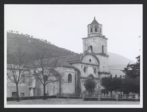
getty_church2

Last summer we told you that the J. Paul Getty Museum launched its Open Content Program by taking 4600 high-resolution images from the Getty collections, putting them into the public domain, and making them freely available in digital format. We also made it clear — there would be more to come.

Yesterday, the Getty made good on that promise, adding another 77,000 images to the Open Content archive. Of those images, 72,000 come from the Foto Arte Minore collection, a rich gallery of photographs of Italian art and architecture, taken by the photographer and scholar Max Hutzel (1911-1988).

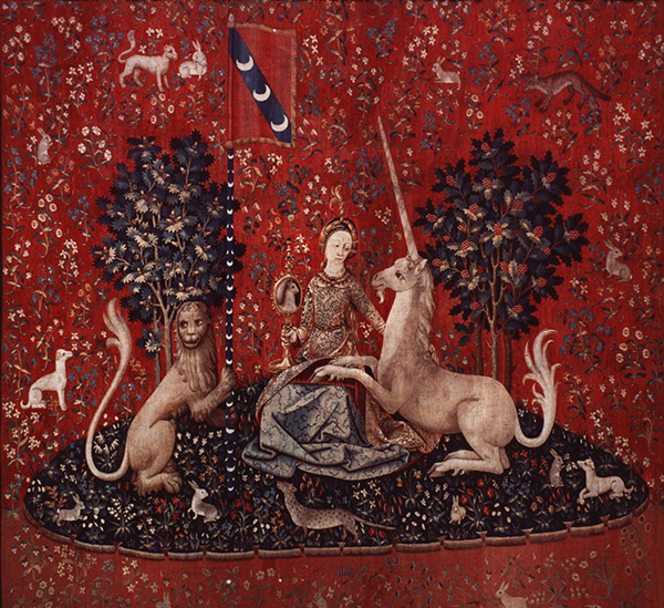
getty tapestryThe Getty also dropped into the archive another 4,930 images of European and American tapestries dating from the late 15th through the late 18th centuries.

All images in the Getty Open Content program — now 87,000 in total — can be downloaded and used without charge or permission, regardless of whether you're a scholar, artist, art lover or entrepreneur. The Getty only asks that you give them attribution.

You can start exploring the complete collection by visiting the Getty Search Gateway. Images can also be accessed via the Museum's Collection webpages. Be sure to look for the "download" link near the images.

For more information on the Open Content program, please visit this page. For more open content from museums, see the links below.

Related Content:

Download 35,000 Works of Art from the National Gallery, Including Masterpieces by Van Gogh, Gauguin, Rembrandt & More

Download Over 250 Free Art Books From the Getty Museum

40,000 Artworks from 250 Museums, Now Viewable for Free at the Redesigned Google Art Project

LA County Museum Makes 20,000 Artistic Images Available for Free Download

The Rijksmuseum Puts 125,000 Dutch Masterpieces Online, and Lets You Remix Its Art

The Getty Adds Another 77,000 Images to its Open Content Archive is a post from: Open Culture. Follow us on Facebook, Twitter, and Google Plus, or get our Daily Email. And don't miss our big collections of Free Online Courses, Free Online Movies, Free eBooks, Free Audio Books, Free Foreign Language Lessons, and MOOCs.

The post The Getty Adds Another 77,000 Images to its Open Content Archive appeared first on Open Culture.


----

Shared via my feedly reader


Sent from my iPad

ein-bleistift-und-radiergummi: Herbert Bayer 1940’s [feedly]


Sent from my iPad

Final project Spring 2014

https://docs.google.com/document/d/1Gf5kHjmT8v2ok4A5wExod7-InE_aZiSFRfdEl-KqHtQ/edit?usp=docslist_api

The Weird Strategy Dr. Seuss Used to Create His Greatest Work (And Why You Should Use It Too)

thewritelife.com/dr-seuss

Download the official Twitter app here


Sent from my iPad

Monday, April 21, 2014

Large-scale Graphite Drawings of Surreal Adventures, Dreamers, and Heroes by Ethan Murrow [feedly]


----
Large-scale Graphite Drawings of Surreal Adventures, Dreamers, and Heroes by Ethan Murrow
// Colossal

Large scale Graphite Drawings of Surreal Adventures, Dreamers, and Heroes by Ethan Murrow surreal drawing black and white
"All Mine"/ graphite on paper 28″ x 28″ 2011

Large scale Graphite Drawings of Surreal Adventures, Dreamers, and Heroes by Ethan Murrow surreal drawing black and white
"State of Massachusettes" / graphite on paper 48″ x 48″ 2014

Large scale Graphite Drawings of Surreal Adventures, Dreamers, and Heroes by Ethan Murrow surreal drawing black and white
"Wanderer above the sea of fog" (homage to Caspar David Friedrich) / graphite on paper 36″ x 36″ 2013

Large scale Graphite Drawings of Surreal Adventures, Dreamers, and Heroes by Ethan Murrow surreal drawing black and white
"Betrayal" / graphite on paper 48″ x 48″ 2012

Large scale Graphite Drawings of Surreal Adventures, Dreamers, and Heroes by Ethan Murrow surreal drawing black and white
"State of Alaska" / graphite on paper 36″ x 36″ 2014

Large scale Graphite Drawings of Surreal Adventures, Dreamers, and Heroes by Ethan Murrow surreal drawing black and white
"State of Nevada" / graphite on paper 48″ x 48″ 2014

Large scale Graphite Drawings of Surreal Adventures, Dreamers, and Heroes by Ethan Murrow surreal drawing black and white
"Lovers Film Proposal" / graphite on paper 24″ diameter 2013

Large scale Graphite Drawings of Surreal Adventures, Dreamers, and Heroes by Ethan Murrow surreal drawing black and white
"Early Warning System" / graphite on paper 48″ x 48″ 2013

Large scale Graphite Drawings of Surreal Adventures, Dreamers, and Heroes by Ethan Murrow surreal drawing black and white
"The Old Aristocratic Colors Break Through" / graphite on paper 48″ x 48″ 2013

Heavily influenced by both film and photography, artist Ethan Murrow creates grandiose theatrical narratives manifested as large-scale graphite drawings. The artworks are populated with adventurers, inventors and dreamers, in what Winston Wachter gallery calls "characters as outrageous innovators and absurd explorers capturing a sense of adventure, satire, fun and defeat." Murrow's latest works involve a series of drawings set in different American states for his show State Flag currently at Winston Wachter in New York through May 2014. You can see much more of his work here and on his website. (via Illusion)


----

Shared via my feedly reader

Saturday, April 19, 2014

Jan van Eyck’s Crucifixion [feedly]


----
Jan van Eyck's Crucifixion
// lines and colors

Jan van Eyck, Crucifixion
This painting by the 15th century Netherlandish master, assisted by members of his workshop, is part of a remarkable set of two panels (thought to be originally a triptych, of which the third panel is missing). Each panel is only 22 by 7 inches (56x20cm). The other panel depicts the Last Judgement (more on that in a later post).

Van Eyck, perhaps the first great master of oil painting, has imbued his image with remarkable depth, and dedicated his attention to extraordinary detail, from the individual character of the multiple faces to intricate rendering of costume and such painterly touches as the reflection of figures in the shield of one observer.

Under a sky whose clouds might be a scientific study for meteorology, the visceral telling of the story unfolds against a background that recedes through a contemporary European city and over a river, on back to the atmospherically blued mountains beyond.

Presumably, in common with Van Eyck's other paintings, almost everything here has significance, from the horse and rider in the middle distance to the identity and role (and expressions!) of those in attendance — whether historic in the context of the moment, or contemporary in relation to the patron for whom the work was created. (It might be assumed that the small scale work was created for personal devotion rather than display in a church.)

The original is now in the collection of the Metropolitan Museum of Art.


----

Shared via my feedly reader


Sent from my iPad

Thursday, April 17, 2014

10 Rules for Students and Teachers Popularized by John Cage [feedly]


----
10 Rules for Students and Teachers Popularized by John Cage
// Open Culture

JohnCage_teaching rules

Avant-garde composer John Cage started out as a disciple of Arnold Schoenberg. He greatly looked up to the exiled Austrian as a model of how a true artist ought to live. Cage, in turn, inspired generations of artists and composers both through his work – which incorporated elements of chance into his music – and through his teaching.

One of those whom he inspired was Sister Corita Kent. An unlikely fixture in the Los Angeles art scene, the nun was an instructor at Immaculate Heart College and a celebrated artist who considered Saul Bass, Buckminster Fuller and Cage to be personal friends.

In 1968, she crafted the lovely, touching Ten Rules for Students and Teachers for a class project. While Cage was quoted directly in Rule 10, he didn't come up with the list, as many website sites claim. By all accounts, though, he was delighted with it and did everything he could to popularize the list. Cage's lover and life partner Merce Cunningham reportedly kept a copy of it posted in his studio until his dying days. You can check the list out below:

RULE ONE: Find a place you trust, and then try trusting it for a while.

RULE TWO: General duties of a student: Pull everything out of your teacher; pull everything out of your fellow students.

RULE THREE: General duties of a teacher: Pull everything out of your students.

RULE FOUR: Consider everything an experiment.

RULE FIVE: Be self-disciplined: this means finding someone wise or smart and choosing to follow them. To be disciplined is to follow in a good way. To be self-disciplined is to follow in a better way.

RULE SIX: Nothing is a mistake. There's no win and no fail, there's only make.

RULE SEVEN: The only rule is work. If you work it will lead to something. It's the people who do all of the work all of the time who eventually catch on to things.

RULE EIGHT: Don't try to create and analyze at the same time. They're different processes.

RULE NINE: Be happy whenever you can manage it. Enjoy yourself. It's lighter than you think.

RULE TEN: We're breaking all the rules. Even our own rules. And how do we do that? By leaving plenty of room for X quantities.

HINTS: Always be around. Come or go to everything. Always go to classes. Read anything you can get your hands on. Look at movies carefully, often. Save everything. It might come in handy later.

Via Gotham Writers

Related Content:

Listen to John Cage's 5 Hour Art Piece: Diary: How To Improve The World (You Will Only Make Matters Worse)

Hear Joey Ramone Sing a Piece by John Cage Adapted from James Joyce's Finnegans Wake

Watch a Surprisingly Moving Performance of John Cage's 1948 "Suite for Toy Piano"

Woody Guthrie's Fan Letter To John Cage and Alan Hovhaness (1947)

Jonathan Crow is a Los Angeles-based writer and filmmaker whose work has appeared in Yahoo!, The Hollywood Reporter, and other publications. You can follow him at @jonccrow.


10 Rules for Students and Teachers Popularized by John Cage is a post from: Open Culture. Follow us on Facebook, Twitter, and Google Plus, or get our Daily Email. And don't miss our big collections of Free Online Courses, Free Online Movies, Free eBooks, Free Audio Books, Free Foreign Language Lessons, and MOOCs.

The post 10 Rules for Students and Teachers Popularized by John Cage appeared first on Open Culture.


----

Shared via my feedly reader


Sent from my iPad

Impermanent Animal Murals Drawn with Chalk and Oil Pastel by Philippe Baudelocque [feedly]


----
Impermanent Animal Murals Drawn with Chalk and Oil Pastel by Philippe Baudelocque
// Colossal

Impermanent Animal Murals Drawn with Chalk and Oil Pastel by Philippe Baudelocque street art pastel murals drawings chalk

Impermanent Animal Murals Drawn with Chalk and Oil Pastel by Philippe Baudelocque street art pastel murals drawings chalk

Impermanent Animal Murals Drawn with Chalk and Oil Pastel by Philippe Baudelocque street art pastel murals drawings chalk

Impermanent Animal Murals Drawn with Chalk and Oil Pastel by Philippe Baudelocque street art pastel murals drawings chalk

Impermanent Animal Murals Drawn with Chalk and Oil Pastel by Philippe Baudelocque street art pastel murals drawings chalk

Impermanent Animal Murals Drawn with Chalk and Oil Pastel by Philippe Baudelocque street art pastel murals drawings chalk

Impermanent Animal Murals Drawn with Chalk and Oil Pastel by Philippe Baudelocque street art pastel murals drawings chalk

Impermanent Animal Murals Drawn with Chalk and Oil Pastel by Philippe Baudelocque street art pastel murals drawings chalk

Impermanent Animal Murals Drawn with Chalk and Oil Pastel by Philippe Baudelocque street art pastel murals drawings chalk

Impermanent Animal Murals Drawn with Chalk and Oil Pastel by Philippe Baudelocque street art pastel murals drawings chalk

French artist Philippe Baudelocque is known for his street murals of animals created with impermenant mediums like chalk or white oil pastels. Each animal is created with a mosaic of delicate line work in the form of organic and geometric patterns that merge to form each piece. Baudelocque most recently participated in the ongoing BergeStreet art event along the banks of the Seine in Paris where he drew the rhinocerous pieces above. You can see much more over on his website. (via Arrested Motion)


----

Shared via my feedly reader


Sent from my iPad

heffydoodle: mbt1991: mrcontro: qinni: The whole film took... [feedly]


----
heffydoodle: mbt1991: mrcontro: qinni: The whole film took...
// Art and Reference point


heffydoodle:

mbt1991:

mrcontro:

qinni:

The whole film took me altogether about 5 grueling months (usually 10-12hours a day) to do. I often felt my butt was going to grow into the chair I usually sat at. 

Please note that this was simply my way of doing my film to achieve the soft-shaded style I wanted; there are many other ways of doing this and some are a lot faster with different results~! :)

This tut differs a bit from my dA version, because tumblr lets me put the combination of gifs and jpegs :D. 

Here's a book that will really help you start animating:


here's some books that are good for composition, storytelling and colours:


I hope these helped

I ask that no one removes the credit or source for this tutorial/guide please. thanks :)

And this is a keeper!  No doubt about that!  :)

I'm just gonna put this one on standby

for when I start my senior film!


----

Shared via my feedly reader


Sent from my iPad