Wednesday, June 21, 2017

A Neural Network Generates Surprisingly Elegant Images of Dinosaurs Composed of Plants


----
A Neural Network Generates Surprisingly Elegant Images of Dinosaurs Composed of Plants
// Colossal

Artist and writer Chris Rodley utilized a deep learning algorithm to create these really lovely illustrations of dinosaurs composed of plants. The images were generated with an online service called DeepArt that lets you upload a "target" image and then apply a visual style to it. For step one he fed the network images of common dinosaurs and then applied the styles of 19th-century fruit engravings and botanical illustrations. The results are a sort of 21st-century artificial intelligence channeling Giuseppe Arcimboldo. You can read a bunch more about all the technical mumbo jumbo over on Sploid. (via Kottke)


----

Read in my feedly


Sent from my iPhone

Making Art in a ‘Vacuum’?


----
Making Art in a 'Vacuum'?
// Artist's Network

5 Simple Ways Savvy Artists Can Exhibit Their Artwork

Gary Hallgren | Dean Nimmer | How to Exhibit Your Artwork | ArtistsNetwork

This cartoon by my friend, Gary Hallgren, shows an artist working alone on a blank canvas in the "vacuum" of his studio.


At times you may feel you are just making art for yourself; no one sees it; no one knows about it; and, ultimately, no one cares about it. However daunting showing your artwork to others may seem, it can help you get out of a rut and become more confident with your art-making process.

Ready to be seen? Here are five helpful ways you can start exhibiting your artwork and garner more exposure as an artist.

1. Get Your Foot in the Door

If you don't have much experience, seek out possibilities to show your work at public libraries, government agencies and municipal buildings. Check into your local city hall or chamber of commerce, which may have empty space available to use for free. Likewise, you could find a native politician willing to put up your work on loan to decorate their office—a win-win for them and for you.

Another great way to start promoting your art is by joining a nearby art club, artist co-op or nonprofit gallery to exhibit your work. Restaurants, coffee houses, and other businesses in the area might also be willing to let you showcase your art.

Various places and businesses around your hometown are generally low-cost, high-effort prospects that offer exposure and free publicity and visibility for your work. Keep in mind you likely will pay for show cards, listings on social media, reception costs and doing any necessary legwork on your own, but this all saves a lot of money in the end (while also putting you in the right direction to start making money!).

2. Collaborate with Other Artists

If you are really ambitious, make up your own show with a group of artists by renting a space in a vacant storefront and sharing the costs. You likely can get free publicity from news outlets looking to cover something unique—an art "happening" rather than just another gallery opening.


Dean Nimmer | How to Exhibit Your Artwork | ArtistsNetwork


I organized a show in a local hardware store where the artworks were placed in and among the tools, nuts and bolts, fertilizer bags and barbecue grills, mixing art into an everyday business.

Local as well as national media sources covered this peculiar event, which brought in more than 150 people at the opening reception. In fact, the store doubled its business over the two-month run of the exhibit.


Dean Nimmer | How to Exhibit Your Artwork | ArtistsNetwork


Please feel free to steal this idea if any hardware stores in your town would be up for the exhibit. At the very least, I hope this unusual art exhibit inspires you to think outside of the box. The lesson here is to use your own creative brain to make a place for your art.

3. Be Cognizant of Online Opportunities

A cautionary tale, there are lots of opportunities to exhibit your work all over the web. These online exhibits most likely will encourage you to enter art competitions for a fee, sometimes exceeding $30 or more. Though many of these are legitimate contests and galleries offering actual exhibitions and prizes, it's important to remember there are a lot of scams, too.

Read over the entry guidelines, look for past winners or featured artists from preview competitions and galleries, and find out what all is included if a fee is charged.

Remember, these competitions are pretty much art lotteries that may or may not go your way. Make sure if you do enter any online galleries or competitions, that they are worthy of your investment. For example, international shows and contests will attract large numbers of people from across the globe, which means tons of other artists are also submitting their art, too.

Moreover, look into how the online gallery/competition requests your art. Are there shipping or uploading costs involved in addition to the entrance fee? Are there any limitations or extra charges for weight and size dimensions?

My advice: Do your due diligence and research, research, research. Make sure there aren't any hidden fees and that the online gallery/competition is legitimate before submitting your work.

4. Take the Open Call

Oftentimes, open calls are available to artists to apply for shows organized by public galleries in museums and colleges that have little or no application fees. If you find an open call for such an event, it's well worth the effort to apply. Often these sites have thematic exhibitions that your work may fit into—landscapes, portraits, still life, abstracts, etc.

Due to the exposure and the likely large-scale audience that will be in attendance, these opportunities are very desirable to most artists. What's more, being accepted into a museum show is also a very good footnote on your resume, too!

Apply for Galleries

Dean Nimmer | How to Exhibit Your Artwork | ArtistsNetwork

By Design by Dean Nimmer


Applying to show with an established private gallery can be an intimidating and frustrating process. A reputable gallery already has their own group of artists, many of whom have been with them for several years, and they rarely look for newer artists to invest in.

Running a private gallery is indeed a huge investment of time, effort and money which can be a tough road no matter how good the economy. So when a gallery director looks at your work, it's not just about whether they like it, but rather if they can sell it for a profit.

Private galleries typically get 50-60 percent commission to exhibit your work, and that's standard in the business. If that seems outrageous, keep in mind they have to pay an expensive rent, a salaried staff, for advertisements of your work as well as foot the bill for the reception and any other expenses.

The real talent of sales managers at galleries, however, is to convince a prospective buyer that your work is worth the price they're asking. If they fail, you fail, too; and that's a lot of pressure all around.

***

Dean Nimmer is a North Light Books author, artist and teacher. Check out his art his fun-filled video workshops on ArtistsNetwork.tv and/or at the North Light Shop. You can also learn more about Dean and his art by visiting his website, DeanNimmer.com.

The post Making Art in a 'Vacuum'? appeared first on Artist's Network.


----

Read in my feedly


Sent from my iPhone

Astonishing Stories v02 n04 [1941-04]


Sent from my iPhone

Sunday, June 18, 2017

Everything We’Ve Learned From Making 4,000 Infographics


----
Everything We'Ve Learned From Making 4,000 Infographics
// Visual News

This article originally appeared on Column Five.

With over 4,000 under our belt, we've learned a lot about how to make infographics in our time. (We even wrote a book about it.) It's been almost a decade since we started, and although the publishing landscape has changed since our early days of million-view infographics on Digg, they're still a great way for brands to build brand awareness and communicate with the world. The format has even evolved since we've been in the game, allowing us to create more exciting, dynamic infographics than ever.

But there are still a lot of awful infographics in the world. Some are made with good intentions, some could just use a little tweaking, and some are a straight-up nightmare. But most of those ineffective infographics could be great with the right direction.

HOW TO MAKE INFOGRAPHICS

We've made infographics for everyone from small startups to Fortune 100 companies. We've learned what works and what really throws a wrench in the infographic process, from that first brainstorm to the moment the project goes live.

We don't want you to waste your time creating less-than-awesome content, so we're sharing our best tips to create solid infographics, based on everything we've learned. Here's our step-by-step breakdown of the process and what will help or hurt you at each stage.

THE PROCESS

In general, the infographic creation process looks like this:

The most important thing to remember is that each stage builds on the other, so you need clear communication and sign-off at each stage to move things forward and create a piece of content that works for everyone. (Basically, by the time you see your first infographic design, you aren't looking at an entire "first draft." The idea and copy should have been locked and edited several times by the time you get to that stage.) There should be no surprises on the back end.

START WITH STRATEGY

The process to make a successful infographic starts way before you ever come up with an idea.

People often get excited at the idea of an infographic and want to head into design immediately, but this is the number one thing that sabotages an infographic. Whenever we kick off a fresh project with a partner, we start with a meeting to confirm what the project's goal is.

At this stage, you're setting the groundwork for the project. Your job is to ask the right questions to identify exactly what you want to achieve.

1) WHO ARE YOU TRYING TO REACH?

If you want your infographic to succeed, knowing who you want to reach is paramount. You should be able to identify who your audience is or who your audience segments are, as well as their pain points and desires. This will help you create an infographic they actually care about.

If you haven't already, create audience personas that include demographic and psychographic information to guide these discussions. (Try our quick exercise to build your personas in less than an hour.)

2) WHAT IS YOUR GOAL?

What are you trying to achieve with this piece of content? How does it fit into your short- and long-term marketing goals? Wanting to create an infographic because they're "cool" is not a reason. It can actually be a huge waste of time if it's not tied to your larger strategy.

3) IS AN INFOGRAPHIC WHAT YOU NEED TO ACHIEVE THAT GOAL?

This is a big one. Way too often we see people get excited about a certain format or trend and go all in. Sometimes they want to create something because a competitor did. Other times they just want to appease a higher-up who wants what they want because they want it. Over and over, we remind people that format should be determined by the story you're telling. An infographic may absolutely be the right format, but a GIF series, interactive infographic, motion graphic, or video might be the better solution.

4) HOW ARE YOU GOING TO DETERMINE SUCCESS?

Your KPIs will tell you whether or not your infographic worked; they should not be an afterthought. If you need tracking links or analytics set up, these are all things that should be locked down before you go into production.

Other things to consider:

  • Who needs to weigh in on the content created? Too many cooks in the kitchen or a major edit right before publication is a pain in the ass.  
  • Who will own the project? Decide who will consolidate edits from stakeholders, who will coordinate with design and PR, who will make sure that what's created aligns with the project goal, and who will problem-solve along the way.
  • Where is this going to live? In our early years, we were always shocked to deliver a slick infographic, then find out our partner doesn't even have a blog to post it on. Knowing where this is going to be displayed will also influence design. Don't surprise anyone down the line.

Once your team understands the project goals, only then can you move into the fun part: coming up with awesome ideas.

FIND THE RIGHT IDEA

Too many brands try to make infographics for themselves—not for the people they're trying to reach. Great ideas are only great if they work for the core audience. It's easy to get hyped up on a fun or interesting idea, but it will ultimately fail if you forget who you're creating it for.

STEP 1: BRAINSTORM

Bring the right stakeholders together at this stage, including your copywriter, art director or designer, and PR. PR is particularly important, as they know what publishers and influencers are interested in. They can also help facilitate co-partnerships, which is a strategy that we love to use. (Read more about how to approach publications for this type of content.)

Brainstorms can be tricky when you have a lot of stakeholders (or egos) in the room. Remind your team what the ultimate goal is to keep discussions on track. Something that helped us tremendously was learning about the 4 different types of creative brains. (Understanding what type of thinker you are and how to better communicate with others will save your sanity.) You can also try these 16 methods for coming up with great infographic ideas.

STEP 2: VET YOUR IDEAS

A freestyle brainstorm sounds fun, but you're here to achieve a goal. Vet every idea to make sure it really will capture people's interest.

  • Does this solve a problem, expand their knowledge, or have a practical application?
  • Is it relevant to them?
  • Would they want to share it?
  • Has this been done already? Can you do it better or give it your own spin?

STEP 3: WRITE A CREATIVE BRIEF

This document keeps everyone on the same page and outlines everything anyone working on the project needs to know. If you don't have that information available, you might end up with an infographic optimized for web publication that was supposed to be an enormous visual for a tradeshow presentation (not that that's ever happened to us—multiple times).

If you need a little help there, follow our guide to writing creative briefs your team can actually use.

Also, we find that there can be some confusion when talking about infographic creation. Before you head into production, make sure your team is all on the same page with the same language. A few terms to know:

  • Data visualization: Strict visualizations of data, which include charts and graphs.
  • Infographic: A graphic combining copy and data visualization.
  • Information design: A graphic that visually displays information but not necessarily data (e.g., a flow chart).
  • Interactive infographic: Web-based content that users can interact with and/or manipulate.
  • Animated infographic: An infographic that features animation (aka movement). It's sometimes called a GIFographic.

TELL YOUR STORY

A lot of people think infographics are eye-catching and therefore effective, but that's way off. A well-crafted infographic is effective because it tells a story. Combined, the text and visuals make that story easier to understand. Your words are the backbone; design enhances your words. The stronger your story, the better your infographic.

Dig into your data: Data storytelling is a powerful way to communicate, but only if you have a strong data set that actually has a story. A few things to keep in mind:

  • Proprietary data is gold: Your own data is one of the best sources for unique, original stories. Look at internal data, including research, studies, surveys, reports, etc. Here are 9 places to look for great data.
  • A statistic is not data storytelling: Just adding a single stat to your infographic doesn't mean you're doing data right. A great data story extracts meaning and insight from a data set. Try these 5 tips to find stories in your data if you're stuck.
  • Data can be manipulated, misinterpreted, or misrepresented: You should always use a credible, non-biased source for data. Follow these 5 tips for sourcing infographics to stay legit.
  • Provide context and insight: When you do have a strong story (ideally from a single, solid data set), provide context and insight to guide your reader through the content. BTW, please don't stuff your infographic with every single data point just because you can.

Tell a single story: We've all encountered monster infographics that never seem to end. It's tempting to cram as much as you can into your story, but an infographic is effective when it tells a strong and straightforward story that brings more clarity to a topic. If you have multiple angles or aspects of a story, it may be better told through a series of infographics.

Here's a good litmus test: Is it easy to write the headline for this story? Can you summarize your message in a few sentences (or a PR pitch)? If you have trouble writing your story succinctly, people will have trouble understanding it.

For more help, find out how to craft a strong infographic narrative.

Structure content in a logical hierarchy: Good design starts with copy. The better you structure your content, the easier it is for users follow the story and the easier it is for designers to lay it out intuitively.

Write to your reader: You should be telling a story they want to hear—and telling it in their language. Write to their level of understanding, explain terms that may be unfamiliar, and, dear god, avoid buzzwords.

Channel your brand voice: Your brand is made up of humans. Your brand voice should be human, too. No one likes corporate speak or dry language. Always give your content a second edit for tone and word choice. Here are a few more ways to take the BS out of your content.

Don't get too clever: Sometimes marketers get excited about a certain story concept or metaphor, but if it doesn't fit the story, it will do more damage than good. (Would a beauty brand campaign be about "scoring a homerun"? Probably not.) The same goes for headers. Be careful with puns. People want to know what the infographic is about—not decipher some obscure reference.

Kill redundancies: Be as succinct as possible. Context is important, but there's no need to over explain. Design is there to do the heavy lifting and bring elements to life, so let it do its job. If a graph shows a 50% increase, the body copy, subhead, and callout do not need to reiterate the 50% increase.

Watch your wordcount: Infographics are not term papers or opportunities to prove to the world that you went to grad school. In fact, they require much less text than you'd expect. Condense and cut as much as you can. This allows more breathing room for design and helps you keep your story tight.

Edit and approve: Save yourself headaches and make sure everyone signs off on copy before you go into design.

DESIGN A GREAT INFOGRAPHIC

Great infographic design is meant to enhance the copy, increase comprehension, and make the content as visually appealing as possible.

The number one question to ask when designing: Does this serve the story?

Know your specs: Are you designing for print? Social? Web? Mobile? Responsive? What's your resolution? This is relevant not just for practical reasons but to help achieve your goal. If the goal is to increase FB followers, the infographic better be optimized for social.

Read the content before you design: It's an obvious one, but it's important. You need to know what you're really trying to express and you need to double-check that all copy is there.

Design data according to best practices: Good data design doesn't just depict data; it uses design to enhance comprehension and bring clarity to complicated subjects or concepts. The design elements and copy should work symbiotically to tell a cohesive story—rather than design just reiterating what the copy already communicates. To make sure your data visualization is on point, read up on best practices and find out how to design the most common charts and graphs.

Follow your visual language: Every brand needs a visual language. Imagery, photography, and iconography are all tools to communicate your brand story. That said, follow your brand guidelines! If your brand is all about minimal line drawings, a brightly colored photo-based infographic is a fail. For more on that, find out what 4 things your brand style guide needs.

Be consistent: Six different typefaces and sizes or 2D and 3D illustration combined in one infographic—these are the eyesores to avoid. Again, your brand's visual language will likely have guidelines for these things, but keep an eye out for consistency. You should also avoid these 8 design mistakes in your visual content.

Experiment when you can: Not all infographics have to be static illustrations. If your visual language allows, you can try working with papercraft, photography, or motion. For example, we turned our infographic about the trends for the future of infographics into an animated infographic for INC, which helped us tell the story in an even more exciting way.

Solicit useful design feedback: Ask the team to tell you what they think is working and what is not working instead of what they like and don't like.

Proof the infographic: Before you send your infographic into the world, triple check that the copy is clean and the design is on point.

  • Is all copy there?
  • Are there typos?
  • Does it have a logical flow?
  • Is everything aligned?
  • Are data visualizations accurate and best represented?
  • Is the resolution correct?

Nothing's more embarrassing than a major error. (Let's not forget the Fox News pie chart that totaled 193%.)

DISTRIBUTE YOUR INFOGRAPHIC

Writing a great story and designing a stellar infographic are only half the battle. Getting eyeballs on your work is what will help you ultimately succeed. To help your team distribute the infographic effectively, there are a few extra steps.

Optimize your infographic for SEO: Make sure you have the right file names and keywords to get the most SEO traffic. For a full rundown of everything you need to do, follow our guides to optimize your infographic for SEO and optimize your blog for infographic publishing.

Create shareable assets: Coordinate with your design team to get assets for your channels. Make sure you have the right resolution, file formats, and sizes, whether it's going out via email, blog, or social. Breaking up an infographic into different assets is a great way to get more mileage from the content. You can read more about how to do that with a divisible content strategy.

Craft a compelling pitch: If you're trying to get coverage (and you should be), you need a pitch that explains why your infographic is interesting and relevant to their readers.

  • Use an attention-grabbing subject line: Journalists and influencers get a ton of email. Give them a reason to read yours.
  • Keep your pitch personal and brief: Put the story front and center.
  • Highlight key takeaways: Include a brief overview, as well as a few bullet-points or "tweetable" stats so the journalist doesn't have to dig for them.
  • Include multiple story angles: Pitch stories that will best align with their readers. If appropriate, offer to write a sample post for your infographic if the journalist is strapped for time.

We hope these tips help you create better infographics and think more critically about your current process. Things are always changing in the marketing world, and even some of these tips may be outdated in a few years, but we'll do our best to share everything we learn. If you have some of your own tips, send them our way.

Need some more infographic inspiration?


----

Read in my feedly


Sent from my iPhone

Talking Fantasy Illustration with Jeffrey Alan Love


----
Talking Fantasy Illustration with Jeffrey Alan Love
// Print Magazine

"Totentanz: The Dance of Death" by Jeffrey Alan Love for The New Yorker - AD: Deanna Donegan

'Totentanz: The Dance of Death' by Jeffrey Alan Love for The New Yorker – AD: Deanna Donegan

Illustrator Jeffrey Alan Love's work is primal, carving out the unspeakable truth of his subjects. Each illustration sits as a relic, the cave paintings of a long dead people. In his work in the realm of fantasy and science fiction, Love makes the strange fiction of those narratives human.

In 2016, Flesk Publications released Love's first graphic novel, Notes From the Shadowed City. The book plays as the sketchbook of the book's hero, an amnesiac warrior wandering through an unknown city, chronicling the beasts and strangers he meets along the way. Each page reads as the impulsive scrawl of someone post-dream, the illustrations capturing the core of what was seen, while the details have already faded.

[Related: Talking Comics and Movie Posters with Illustrator Matt Taylor | Things to Consider When Pricing Illustrations]

Love's career has gone from newspapers and magazines to his current place as a major voice in science fiction and fantasy illustration. Along the way, he has evolved from student to guest instructor at the Illustration Academy, gone from a digital workflow into a strictly hands-on exploration of inks and paper.

'Rathraq' by Jeffrey Alan Love

'Rathraq' by Jeffrey Alan Love

CJ: Something I find incredibly interesting is the fact that you've been an instructor at the Illustration Academy as well as a student. Having spent some time in art school myself, the biggest hurdle is finding, or just staying, with a style long enough to have it develop into something meaningful. As an instructor and career artist, what sort of guidance are you hoping to give the students?

JAL: I hope that students can look at me and think, "if this guy did it, surely I can do it too!" It's a long journey to go from a dream to a reality of making a living as an artist, and often it isn't that they fail but that they call it quits too soon. I was not one of the standout students when I attended the Illustration Academy, but I just made the mental commitment to never give up even when it seemed like I would never make it.

One thing that I responded to when I was a student at the Illustration Academy, and I try to teach now when I'm there, is that it isn't a certain style or surface look that is going to give you traction and longevity within the field, but a personal voice. It is your brain, how you think, the way you solve problems, the stuff you love and that resonates with you and that comes out when you make art. A trap I see a lot of students fall into is thinking they have to find a "style" that defines them, or that they have to stick with the style that they have used in their initial portfolio. They are trying to discover a style, a surface effect, instead of speak with their own voice.

For me, you learn to speak with your own voice by playing with mediums, methods, subject matter. Sketchbooks are the perfect playground for this if you can get over the temptation to show it off to other people and let it be a private, safe place where you can screw up, make bad art, and discover fun new ways of working within those supposed mistakes.

To address something you said about finding and staying with a style for long enough, maybe that's not the way—allow yourself to play, to go wild, to try anything that comes to mind that you think would be interesting—it may take you some time to realize, looking back, that you discovered something worth pursuing. Don't narrow your options too soon by trying to stick with a style. Go crazy—you only live once.

'Snarling City' by Jeffrey Alan Love

'Snarling City' by Jeffrey Alan Love

Before going freelance, you worked at a newspaper doing in-house illustration. Were you still working in the style you are now? (Since in your Reddit AMA you mentioned hamburgers being shot out of canon, I'm guessing not!)

I've actually always been freelance, but when I started my work was almost completely editorial – for newspapers and magazines. My work looked nothing like it does now—it was all linework with digital color. When it came time to make my first portfolio I had no idea what my work should be, or what my personal voice was. I realized the only thing I could point to and say that it was honest and mine was the way I drew from observation in my sketchbook with a parallel pen. So for the first year or so of work, I would draw from life (when I could—I couldn't find a hamburger cannon), and then digitally color it. Eventually, I started chafing at this "style" and started trying something new with each assignment.

I was trying to find some examples of your previous work but had no luck. Is that on purpose?

That actually makes me pretty happy that it's hard to find the old stuff online—it's always a bummer when someone hires you and asks if you can do a piece like something you did a long time ago that you don't like anymore.

Jeffrey Alan Love's cover for 'Return of Souls' by Andy Remic - Tor.com Novella Imprint - AD: Christine Foltzer

Jeffrey Alan Love's cover for Return of Souls by Andy Remic – Tor.com Novella Imprint – AD: Christine Foltzer

If a client finds you, somehow, through your old portfolio of illustrations, do you turn the job down or give them what they want?

If a client approaches me asking if I can do something like an old piece of mine, I will let them know that I don't work that way any longer and show them examples of how I work now. Keeping my website updated is important in this aspect—I don't want anything on there that I wouldn't want to do again. When I started out it was harder to say no, because I needed the money to pay bills, but now I'm comfortable turning down jobs that aren't a good fit for me, or for making my case why the client should feel comfortable in giving me the trust and freedom to find an appropriate solution for their job with the way I work now.

Nick Cave & Warren Ellis by Jeffrey Alan Love

Nick Cave & Warren Ellis by Jeffrey Alan Love

You posted a piece you did in 2011 of Nick Cave and Warren Ellis. You wrote, "Wasn't smart enough to realize I should keep pursuing this direction, went down a few dead ends before returning to this." It is in your familiar style, and probably as detailed as I've seen you get. Where was your style prior to this? How often were you shifting and changing? Do you see yourself pursuing new directions?

When I first started out I don't know that I had a style—almost every month I was doing something new. I was very restless with my image-making, dissatisfied with what I was making. So I would try all sorts of new things, always searching, experimenting. Often I would do something in my sketchbook and that would make its way into the finals, or I would totally screw up a final and despair for a few weeks, and then look at the screw up and decide that what had happened actually was really cool if I was able to let go of what I was EXPECTING to happen, and then I would pursue a new angle by trying to intentionally make those mistakes.

A lot of style is just making mistakes you've made and like over and over. I really enjoy the way that I've been working for the past two years, mostly black and white, but I can see myself always trying something new. I don't want to stagnate, but I also continue to find new and interesting things to do within this way of working. I feel like I've found my bedrock that I can build upon.

'The Sentinel' by Jeffrey Alan Love

'The Sentinel' by Jeffrey Alan Love

Your work stays very much in the realm of science fiction and fantasy, well, more so fantasy. Did your own tastes dictate that, or was it a matter of that was the type of work you were getting and it snowballed from that?

Definitely my own tastes. I had a health scare that was the catalyst for changing my work, dropping most of the stereotypical editorial stuff I was doing and pursuing personal work. I made a list of all the things I would like to make art about and thought about what was important to me as a child, and all the work I've made since then has had those things in them. Some of my fondest memories as a child are running through the forests in Germany and playing make-believe in castles, so those seem to figure prominently. Trees. Castles. Birds. Knights. Swords. Being a foreigner in a strange land (and loving it for its strangeness.) Once I started making work that felt personal and meaningful to me, people started to respond to it and hire me for it, so from there it has snowballed, but the first snowball was thrown by six-year-old me.

'Hammers on Bone' by Jeffrey Alan Love

'Hammers on Bone' by Jeffrey Alan Love

Science fiction publisher Tor seems to be a very steady client for you, and also one that shows support for you and your work. Were they the first to contact you about doing fantasy work?

I had been promoting my work to Irene Gallo at Tor since I started out, but my work had not been a good fit as my portfolio didn't have any sci-fi / fantasy stuff in it. For some reason I'd thought that my desire to do that type of work plus my potential would get me jobs in the field, not realizing that I wasn't showing that I could actually do good work that fit the industry's requirements. It took a completely new portfolio that had SFF (science fiction / fantasy)  elements to it that got me work in the field. Once I showed I could do work that was SFF, Irene was the first to hire me for it, something I will always be very grateful for. And she has continued to show a lot of faith in my work as it has evolved over the last few years.

'Notes From the Shadowed City' by Jeffrey Alan Love

Notes From the Shadowed City by Jeffrey Alan Love

Notes from The Shadowed City started as sketches and once you had about 30 illustrations, you were developing the story and creating pieces specific for the book. It's an interesting method and makes the book feel more organic. Do you see doing a book this way again, or will you write the story first for the follow-up book?

I'm in the process of writing my next few books, and I think that this process is how it generally runs, even if the story is more planned out and plotted beforehand than Notes was because one is a graphic novel and another is a traditional novel and they need to be more concrete rather than suggestive. Some image or moment presents itself, then another, they can just be weird cool moments that don't seem connected, but that becomes the fun part—figuring out how to connect them and have them make sense and resonate. But with the graphic novel I can't make the final art (as I did with Notes) for a third of the book and then build the rest—I need to know the whole story to make the pages/panels work so the pacing is appropriate.

'City at Night' by Jeffrey Alan Love

'City at Night' by Jeffrey Alan Love

Notes from The Shadowed City plays out as the notebook of the unnamed hero, images are drawn throughout his adventure, which is very similar to how you seem to work. Sketching and writing throughout the day. Do you see the book as a personal story? A fantasy take on your own adventures?

It is definitely a personal story, although I didn't realize how much so until it was printed and I read the actual book. I thought it was mostly the last six years or so, but I saw a lot of my childhood as well in there—growing up overseas, not understanding the language or people, not having close friends, losing myself in my drawing and reading.

Your fantasy illustrations are incredibly visceral—what they make lack in traditional details they make up for in emotional impact. They have the aesthetic and power of a cave painting. Your work feels like long dead stories that are still alive. For short stories and novels, you are providing the only visual clue the reader has into the story. Again, like a cave painting, this is an entire world summed up in a single image. What's your priority when starting on a book cover?

Hopefully, I've been given the manuscript and the time to read it and think about it. That's probably the most important thing—having time, to read and think. You don't always get time, and it often shows I think. Or maybe I'm just a slow thinker—I look at in-house book cover designers and am amazed at their range and intelligence.

As I read I'll make notes of any scenes or moments that evoke strong emotion in me—then I'll go back after I've finished the manuscript and see if I can find a way to evoke that emotion in the viewer of the cover. My priority with a book cover is to make the viewer feel something strongly (even if it's that they absolutely hate the cover…).

'Death & The Green Table' by Jeffrey Alan Love for The New Yorker - AD: Deanna Donegan

'Death & The Green Table' by Jeffrey Alan Love for The New Yorker – AD: Deanna Donegan

'Fierce Competition' by Jeffrey Alan Love

'Fierce Competition' by Jeffrey Alan Love

You count illustrators Les Herman, Edward Kinsella, and other illustrators as friends. Even with very different styles, is it important to have friends who you share a career with for feedback?

It has been very important to me. So much time is spent working alone that it is nice to have someone to reach out to and feel a sense of community with. Les, Edward and Andrew R. Wright and I generally text each other every day, showing new work or sketches or asking for opinions on different things. It's good to have people who will call you on your own bs and not just tell you "it's great" because they don't want to hurt your feelings. Honest friends who are great artists themselves are a wonderful blessing.

'Orange Skies' by Jeffrey Alan Love - limited edition print released by Out of Step Arts

'Orange Skies' by Jeffrey Alan Love – limited edition print released by Out of Step Arts

You've released a series of art prints through Out of Step Arts. Each has been released as a limited edition giclee. With your work having such bold tactile quality, have you considered more hands-on printing methods like screen printing or even etching?

I would love to explore more printing methods, but I don't have the time. The reason I started working with Out of Step Arts is that I hated dealing with inventory, packing, and mailing things so I never offered prints myself. I would rather use that time to write and paint. I want my career to be making books, not standing in line at the post office or emailing people.

Your mark making is rooted in practical tools—paint and whatever instruments you can find for mucking it up. At this point, would digital tools like Photoshop just get in the way?

I don't know if Photoshop would get in the way, but it isn't an enjoyable way for me to work on final pieces. I found that staring at a screen for 8 hours a day made me want to kill myself, whereas working traditionally on paper with physical, tangible materials filled me with energy and life and I could work for hours on end. But that's personal to me, and I don't have any prejudices against digital art. Photoshop is wonderful, and I use it for making sketches for clients, which it is perfect for. Very easy to copy/paste and move things around, try different elements at various sizes, all very quickly without having to redraw the sketch over and over. There is no right way of working, only what works. The hard part is figuring out what works for you individually.


The post Talking Fantasy Illustration with Jeffrey Alan Love appeared first on Print Magazine.


----

Read in my feedly


Sent from my iPhone

Wednesday, June 14, 2017

Gobolinks, Blottentots, and the Eerie Beauty of Victorian Inkblots


----
Gobolinks, Blottentots, and the Eerie Beauty of Victorian Inkblots
// Atlas Obscura - Latest Articles and Places

article-image

Today inkblots are almost universally seen as psychological diagnostic tools. But before the "Rorschach Test" became a household term, there was the Victorian game of Gobolinks, which used inkblots to inspire eerily imaginative poems based on the random chaos of ink dripped on paper.

Technically known as klecksography, inkblot art got its start back in the 1700s. German poet and physician Justinus Kerner is generally credited with innovating the form after he began accidentally dropping ink blots on his papers as his eyesight failed. Seeing them as more than just sloppy mistakes, he would fold the paper and create a single mirrored form, which he would then interpret and add to, ending up with illustrations he would then pair with his poetry. Kerner's artistic work would eventually be published in 1890 in the German language book, Klecksographien.

"The allure for me is that this is a pre-verbal language," says Tyler Kline, a visual artist who has been incorporating klecksography into his own work for over a decade. "With a lifetime of investigation and study, codes and cyphers can be developed. The image will be read on multiple levels." The same evocative ambiguity that make inkblots perfect for psychological readings, make them terrific inspiration for artists of any age.

article-image

Undoubtedly inspired by Kerner's work, released just a few years earlier, two American authors, Ruth McEnery Stuart and Albert Bigelow Paine took his process a step further, when they released their terrifically titled book, Gobolinks, or Shadow Pictures, in 1896. Stuart and Paine envisioned the creation of inkblot art as an act of chaos and imagination. As defined in the book, a "gobolink" is a "veritable goblin of the ink-bottle," The idea being that the blobby splotches of spilt ink create unique creatures free from the creator's influence, but still defined by their interpretation.

"One of the characteristics of inkblots is their dynamic and organic nature," says Kline. "The technique of creating inkblots is one where the ink records a physical action. What was transient now has stasis."

The book also outlines a set of rules that gamifies klecksography. The game of Gobolinks asks players to create ink blots, write a rhyme based on the image, then choose judges among the players to assess which of the blobs are the best, and which is the "booby." The authors also suggest that people dress up for a Gobolinks party, wearing outfits that are the same on one side as they are on the other, just like an inkblot. As they say, "No game could be more productive of amusement than Gobolink."

article-image

As they are presented, the rules are overly complicated, and seem pretty judgmental by modern standards, but the resulting artworks are nonetheless remarkable. Over 84 gobolinks are presented in the book, most accompanied by poems, while a few are simply grouped by their general shapes, into groups like "Seaweeds." Yet they all share the same slightly creepy form and symmetry for which klecksography is known.

article-image
article-image
article-image
article-image

While Gobolinks is the gold standard for whimsical turn-of-the-century klecksography, it was not the only book of its kind. In 1907, a short, but equally delightfully named book called The Blottentots was released, containing another set of ghostly inkblots alongside poetry. While clearly derivative of Gobolinks, the Blottentots were just as unique and charming, but also seemed to embrace the inherently shadowy, otherworldly look of inkblot creations.

article-image
article-image
article-image

In 1921, Hermann Rorschach published Psychodiagnostik, which became the clinical bedrock on which the psychological inkblot test would be based. Klecksography then became more commonly associated with psychology than with poetic exploration. However, using inkblots as art is far from dead. There are still artists like Kline who are still keeping it alive, and even evolving. "My favorite technique is using multiple folds to create a rhythm of symmetry," he says. "I am looking to unlock the hidden asymmetry of klecksographs."


----

Read in my feedly


Sent from my iPhone

Andrés Lozano’s story-packed scenes “appear” in his sketchbooks like visual improv


----
Andrés Lozano's story-packed scenes "appear" in his sketchbooks like visual improv
// It's Nice That

Andre%cc%81s-lozano_itsnicethat_list

In his incredible sketchbooks, Madrid-born illustrator Andrés Lozano creates intricate scenes packed with narrative, that he says unfold in a serendipitous way. "Almost all of my personal drawings are improvised on the go," he explains. "If I start with a really clear idea of what I'm going to draw, I get bored and sabotage the final result. Part of the fun is not knowing where I'm going and if I'm going to fail."

Read more


----

Read in my feedly


Sent from my iPhone

This 'Indian Dr. Seuss' Is Very Fond of Nonsense


----
This 'Indian Dr. Seuss' Is Very Fond of Nonsense
// Atlas Obscura - Latest Articles and Places

article-image

Contrary to what one might like to believe, Anushka Ravishankar does not dream up words such as "Hayakilikileee" in her sleep. Despite having written about baby buffaloes blowing big blue bubbles, math teachers who turn into multiplication signs, and even a Fivetongued Firefanged Folkadotted Dragon Snake, Ravishankar's dreams are admittedly prosaic. "I dream about the things I forget to do," she says. "If I've forgotten to write an email to somebody, they pursue me in my dreams."

At the May launch of Ravishankar's new book in the South Indian city of Chennai, the author enlists the help of a young woman to demonstrate the efficacy of remedies for hiccups that are listed in her book of nonsense verse, Hic!. It is a romp through remedies that range from the renowned to the ridiculous. One vile cure—that of pouring mustard in the nostril—has the children restless with curiosity to see if it really works. Ravishankar's resounding "Hic!" throws them into a collective chortle.

article-image

Twenty years ago, while working with Tara Books, an independent publishing house of international acclaim, based in Chennai, Ravishankar had the opportunity to write her first book to accompany artwork by children's' book illustrator, Pulak Biswas. "For Tiger on a Tree, we needed text which had to be at a tangent to the pictures, so that it didn't repeat what the pictures said," Ravishankar says. "It had to have a life of its own." The book, written in nonsense verse, was translated into eight international languages, and sold over 50,000 copies worldwide.

With over 25 children's books to her credit since, ranging from verse to fiction to non-fiction, Ravishankar is regarded as India's Dr. Seuss. Her books, written in English, have been translated to languages such as Dutch, German, Italian, Spanish, Japanese and Korean.

Ravishankar is best known for her work in the genre of literary nonsense. Following in the tradition of Edward Lear and Lewis Carroll, Ravishankar writes nonsense verse in English that veers towards semantic nonsense of the Carrollian kind.

article-image

Around 2006, Ravishankar discovered India's own legacy of literary nonsense in the form of a book project that attempted to study the nonsense traditions of India. As a member of an online group devoted to the late Edward Lear, an English artist, musician, and writer of literary nonsense, Ravishankar encountered Michael Heyman, an American who was putting together a book called The Tenth Rasa: An Anthology of Indian Nonsense.

"Once we began to correspond, I offered help on the nonsense from the southern states," says Ravishankar. "Until I started working with this project, I didn't realize that there was so much nonsense in Indian languages."

The Tenth Rasa, considered by some as the first non-Western anthology of nonsense in translation in the world, was co-edited by Heyman, Sumanyu Satpathy and Ravishankar. It is a compilation of contemporary nonsense, mainly for adults, in English, as well as translations of nonsense written by some of India's most nimble wordsters. These range from the 15th-century illiterate poet Kabir and his "ulatbamsi," or "upside down language" (Hindi), to the 16th-century jester poet, Tenali Ramalinga's verse that uses only the words for "goat" and "tail" (Telugu), to later writers of nonsense in Indian languages like Sukumar Ray (Bengali), Mangesh Padgavkar (Marathi) and Kunjunni (Malayalam) to contemporary nonsense prose and verse in English by writers such as Sampurna Chattarjee, Shreekumar Varma, and Ravishankar herself. The book also brings the rich language tradition of India to the fore through its nursery and folk rhymes that Indians have grown up reciting, but didn't realize belonged to the nonsense genre.

article-image

"Mangesh Padgavkar, who writes in the Marathi language, was very aware of the idea of nonsense and even coined his own term for it—Vaatratika," says Ravishankar. "But he was also aware that a lot of the time, when one tries to write nonsense, one ends up writing satire or humor."

"The problem is, if you write nonsense, there is a good chance that you will be taken seriously. It happened with The Hunting of the Snark. People wrote to Lewis Carroll explaining to him what the deep profound meaning of the poem was. And actually he wrote it as just nonsense."

article-image

When the time came for Ravishankar to write the introduction to the book, along with her two co-editors, she chose to write it, not in a theoretical sense, but in the spirit of the genre it attempted to celebrate. Ravishankar says, "Reviewers read it and actually reviewed it in all seriousness. It was like the emperor's new clothes."

Back at the book launch, the children come up with their own ridiculous remedies for hiccups. So far, they seem unperturbed by the lack of any definitive solution to the hiccups that besiege the little be-braided protagonist in Ravishankar's book. It is a clever subversion of the quest for sense.


----

Read in my feedly


Sent from my iPhone

Idea to Sketch to Miracle


----
Idea to Sketch to Miracle
// Print Magazine

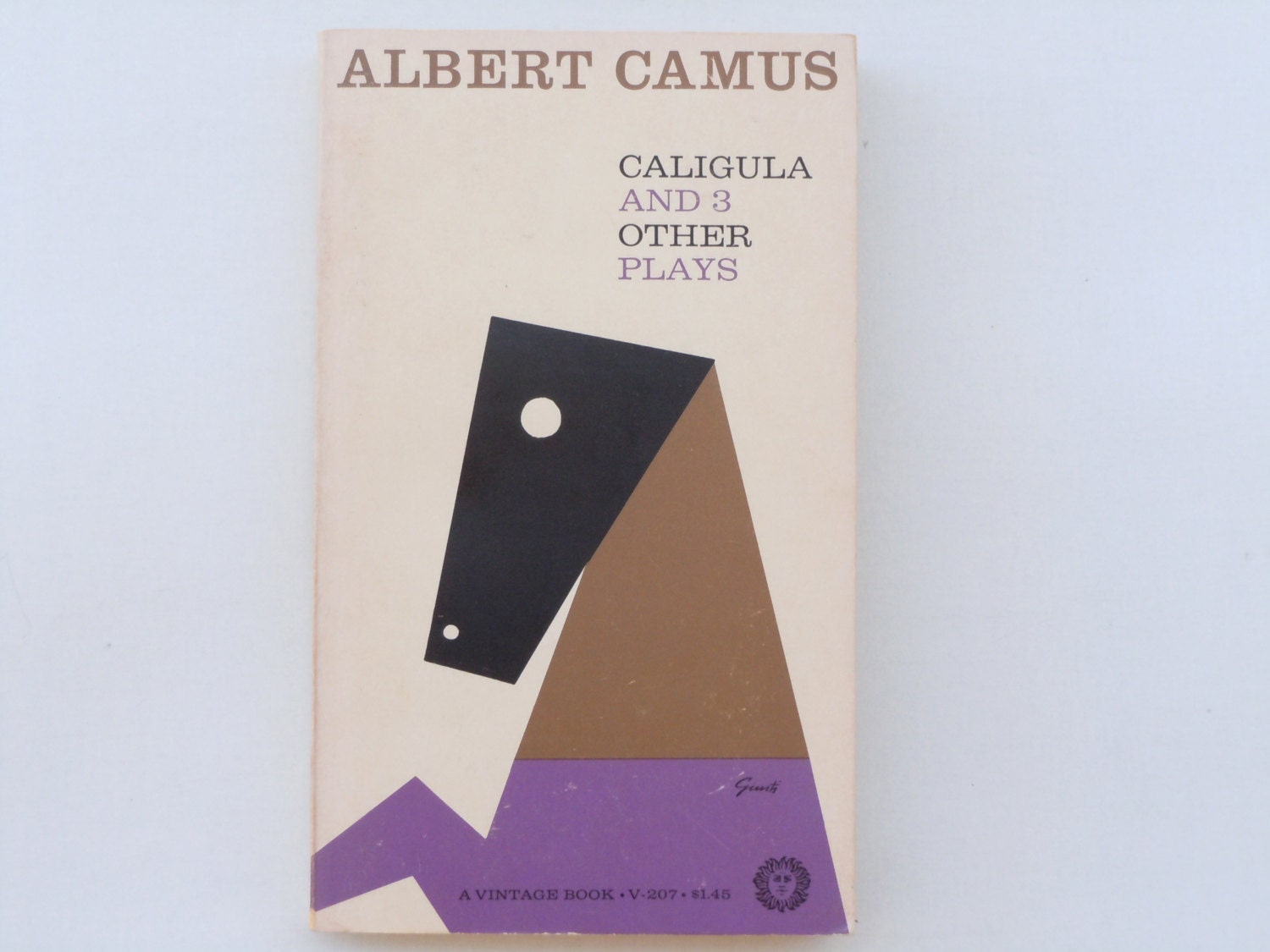
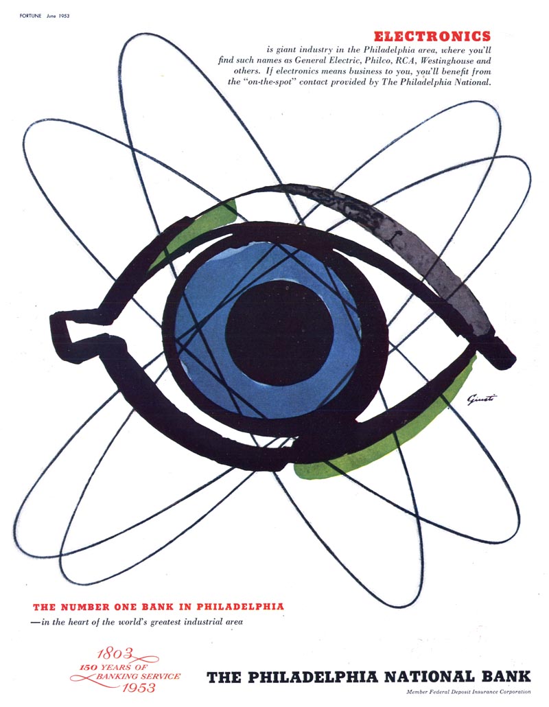
George Giusti (1908–1980) is one of the inspired Midcentury Moderns covered in the forthcoming book The Moderns by Greg D'Onofrio and me. As a kid I recall his wonderful covers for Holiday (one of my favorite magazines) and his book covers for Vintage paperbacks. He was also ubiquitous on the advertising pages of many magazines, combining expressionistic line and brushwork for an unprecedented futuristic effect. "He has succeeded to the extent that his designs are consistently ahead of their time," notes the citation in the Art Directors Hall of Fame, which also says he sought to "build a bridge between fine art and art for commercial use. He disdains the terms 'fine' and 'commercial' as defining a distinction which should not exist. Art is art, he believes, whatever its purported use."

Giusti was born in 1908 in Milan, Italy, of a Swiss father and an Italian mother. He studied at the Brera Academy of Fine Arts in Milan and worked in graphic design there before deciding to move to Zürich, Switzerland, where he opened a design studio, which he operated for seven years.

A month ago, during a visit to the incredible RIT Graphic Design Archive with Vignelli Design Center founder R. Roger Remington, I was privileged to see a collection of Giusti's many sketchbooks acquired for the Archive. Steven K. Galbraith, curator of the Cary Graphic Arts Collection, was kind enough to share a few of my favorite pages with me. Seeing this process work for Holiday, Command Records and IBM, and Giusti's sculpture of Chairman Mao, filled me with awe in the sense that great illustration and design is indeed a process of conception, iteration and a certain miracle that can best be described as a gift. Giusti had that gift.


Support PRINT. Subscribe. 

At PRINT, we don't believe in paywalls. But we still need support from our readers. Consider subscribing to PRINT today, and get in on the conversation of what the brightest minds in the field are talking about right now.

Treat yourself and your team to a year of PRINT for $40—which includes the massive Regional Design Awards issue ($30 on newsstands).

print_2016issues

The post Idea to Sketch to Miracle appeared first on Print Magazine.


----

Read in my feedly


Sent from my iPhone